ETMS
Enterprise Transaction Monitoring System
Transforming an underused transaction monitoring system into a discoverable and accessible operational platform through improved information architecture.
My Role: Product Design Lead | Information Architecture | Enterprise Data Systems | Accessibility
Improved System Adoption
Restructured workflows and information architecture enabled self-service usage without training.
Faster Issue Identification
Improved scanability of transaction data, reducing time to identify critical system issues by ~30–40%.
Improved Data
Clarity
Structured data hierarchy and status logic made transaction states easier to interpret and act on.
Scalable & Accessible Platform
Designed a flexible system that supports growth while implementing accessible interaction patterns.
Project Overview
The original platform supported transaction monitoring across multiple customers and operational sites but had low adoption due to unclear information architecture and limited accessibility.
Users struggled to understand system capabilities, navigate workflows, and interpret large volumes of transaction data.
Redesign Focus
• Restructured information architecture to improve discoverability and workflow clarity
• Designed scalable data patterns for filtering, tables, and transaction states
• Implemented accessibility standards for high-density data environments
• Reworked the data model to align with workflows and support long-term scalability
Outcome
The redesign enabled users to monitor transactions, investigate issues, and take action without training. It also improved data clarity and established a scalable foundation for future system growth.
My Role
I led the redesign of the platform, redefining its information architecture, workflows, and interaction patterns to improve discoverability, usability, and long-term scalability.
Key responsibilities included:
- Defining the platform’s design direction
Reframed the platform into a clear operational system, translating complex transaction workflows into structured, user-centered experiences.

- Architecting information architecture and workflows
Organized transaction monitoring, customer health, and investigation workflows into a coherent system that supports efficient decision-making. - Designing scalable system patterns
Established flexible patterns for navigation, tables, filtering, and status logic to support platform growth without increasing complexity. - Driving accessibility and usability improvements
Implemented accessibility standards and interaction patterns to improve clarity and usability in high-density data environments. - Leading cross-functional collaboration
Partnered with engineers, product managers, and stakeholders to align data structures, technical constraints, and user workflows. - Ensuring design quality through implementation
Guided development and validated implementation to maintain consistency, usability, and accessibility across the platform.
WHY & WHAT
The Challenge
- The original platform supported transaction monitoring across multiple customers and operational sites but struggled with low adoption.
- Users struggled to understand the purpose of the system, its capabilities, and how different workflows were meant to be used.
- Large volumes of transaction data were presented without a clear hierarchy or guidance, making it difficult to determine what information was important and what actions were available.
- Navigation and system states were not clearly communicated, limiting users’ ability to understand how the platform supported their operational tasks.
- As transaction volumes increased, the platform required a clearer structure to help users quickly understand system events, locate relevant data, and take action with confidence.
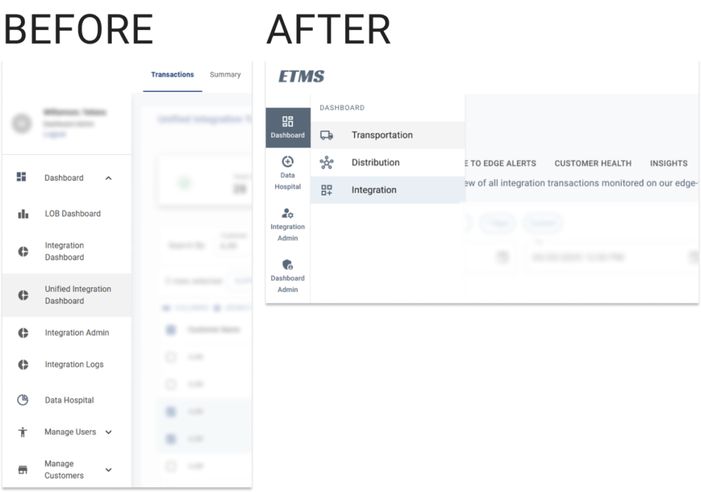
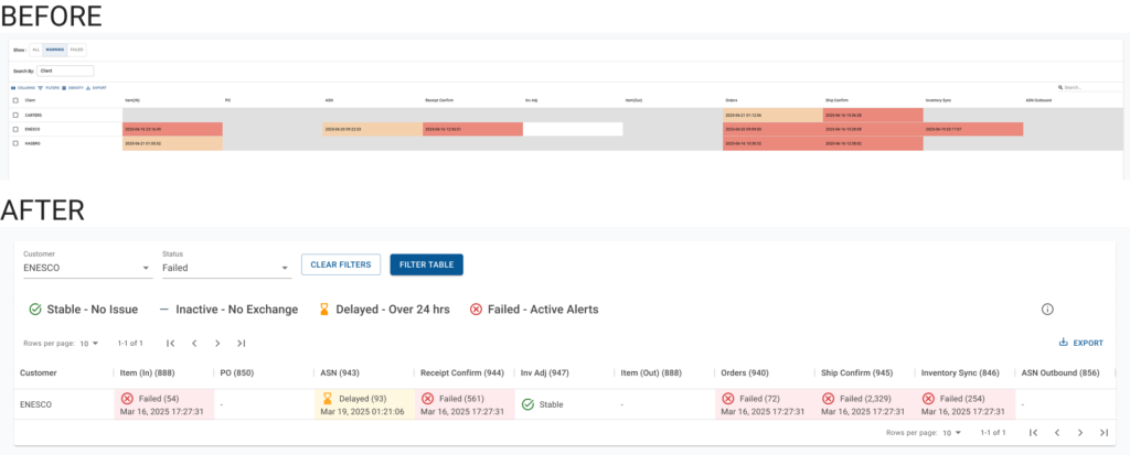
Before: Low workflow discoverability and unclear system purpose
The original interface exposed large amounts of data without clearly communicating system capabilities or available workflows.
After: Structured transaction monitoring and clearer operational workflows
The redesigned platform introduces structured navigation, scalable data, and clearer status logic, enabling users to quickly understand system events and take action.
HOW
The Solution
UX Principles Applied
Information hierarchy
Transaction data was organized with clear hierarchy and status indicators to support rapid scanning and decision-making.
Jakob’s Law
Familiar enterprise SaaS patterns such as structured tables, side navigation, and workflows reduce learning time for operations teams.
Hick’s Law
Interface actions and interactions are intentionally limited to reduce cognitive load when working with large datasets.
Progressive disclosure
High-level system status is visible immediately, while detailed transaction data appears when users drill into a specific record.
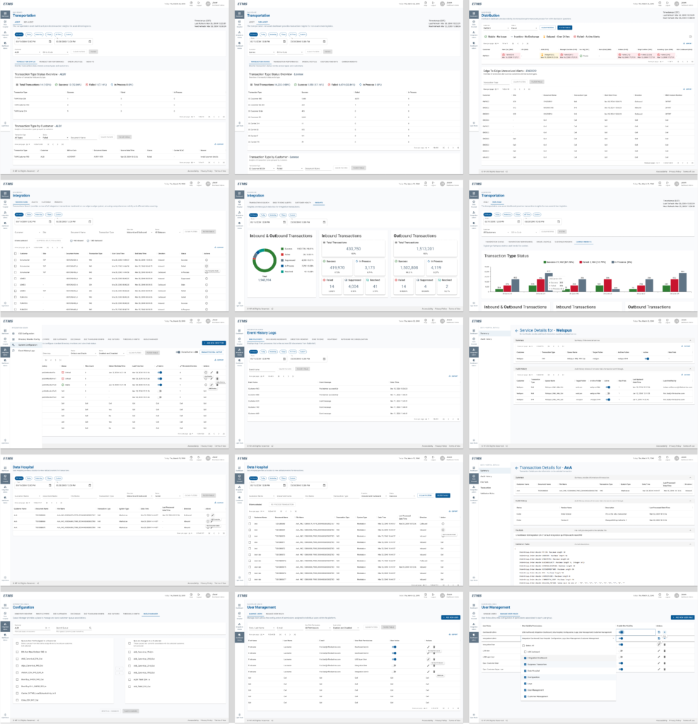
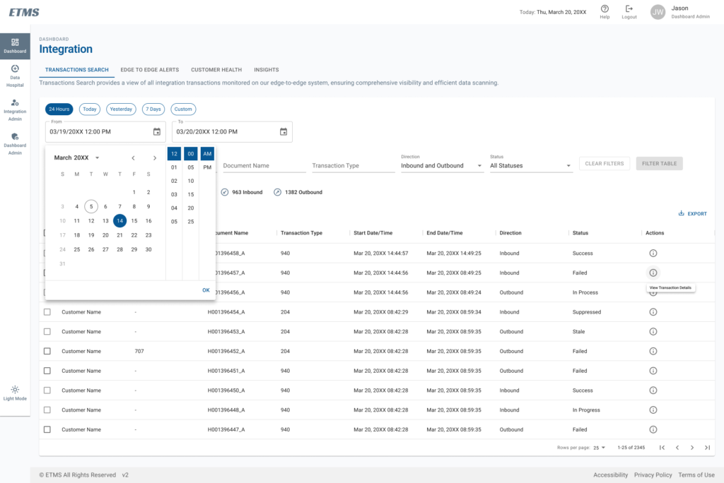
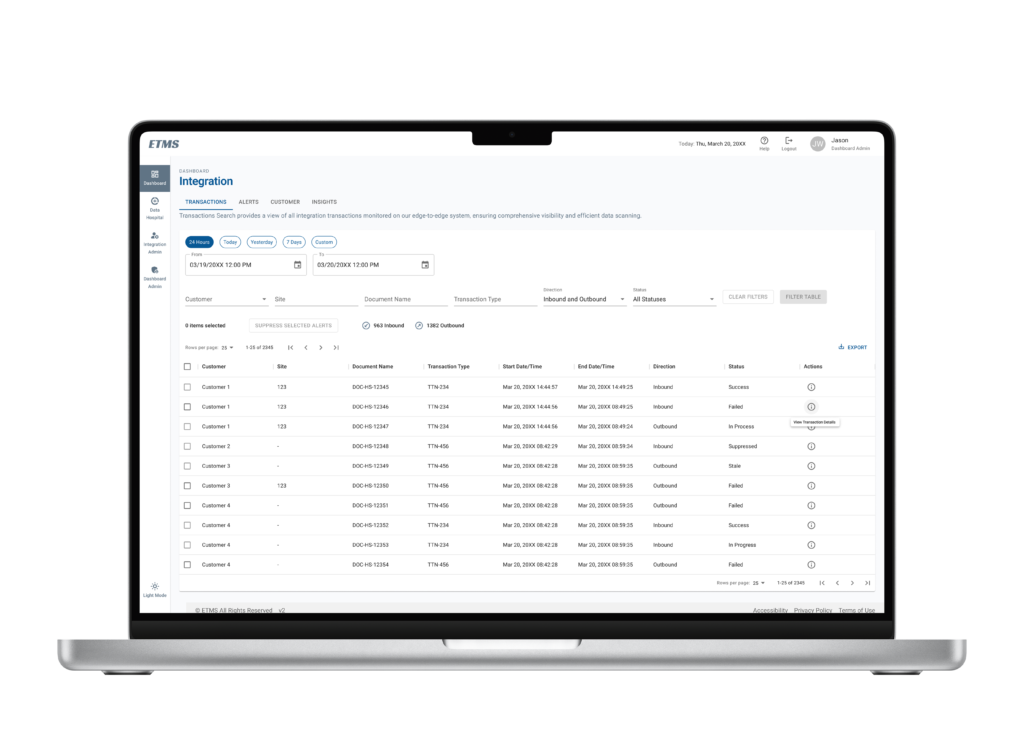
Restructuring Information Architecture
The original platform exposed complex transaction data without clearly communicating system structure or available workflows. I reorganized the platform around how operations teams monitor systems and investigate issues.
Primary navigation defines core system areas, while secondary navigation and tab structures group related workflows. This restructuring made it easier for users to understand what the system does and how to move through it.
Making System Purpose and Capabilities Immediately Clear
One of the core issues was that users did not understand what the platform was designed to do or how to use it. To address this, I introduced clear structural patterns and contextual guidance that explain system capabilities at each level of the interface.
Each primary view includes a short description beneath the navigation, helping users quickly understand the purpose of the page and how the data should be interpreted. This reduced ambiguity and improved overall system discoverability.
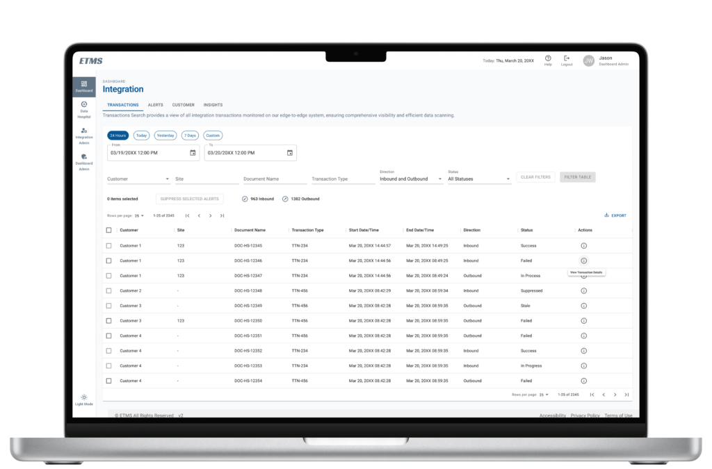
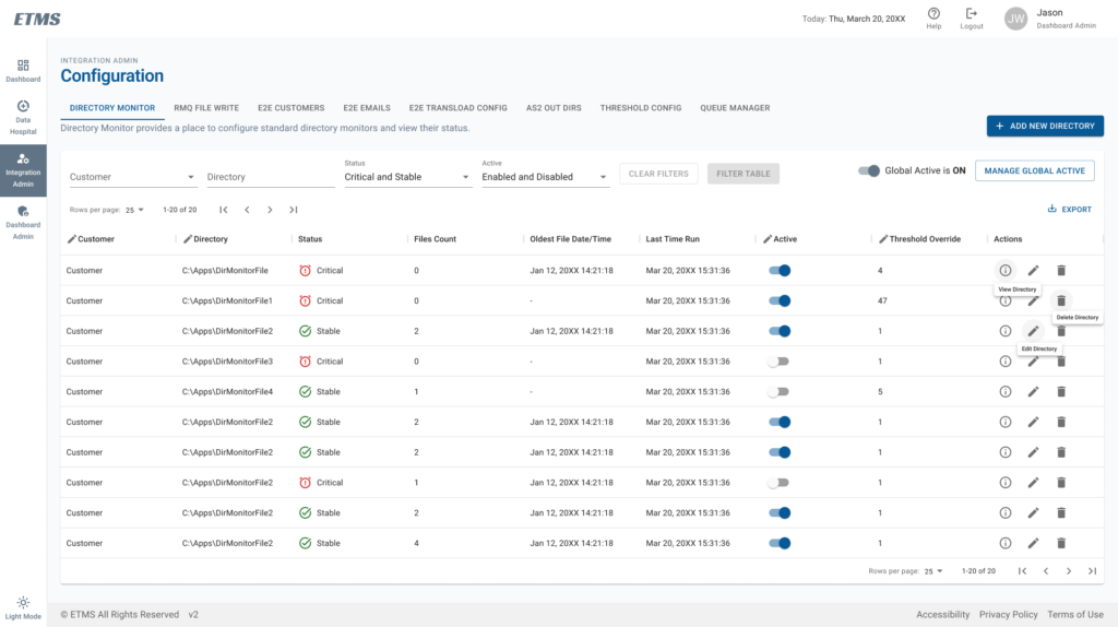
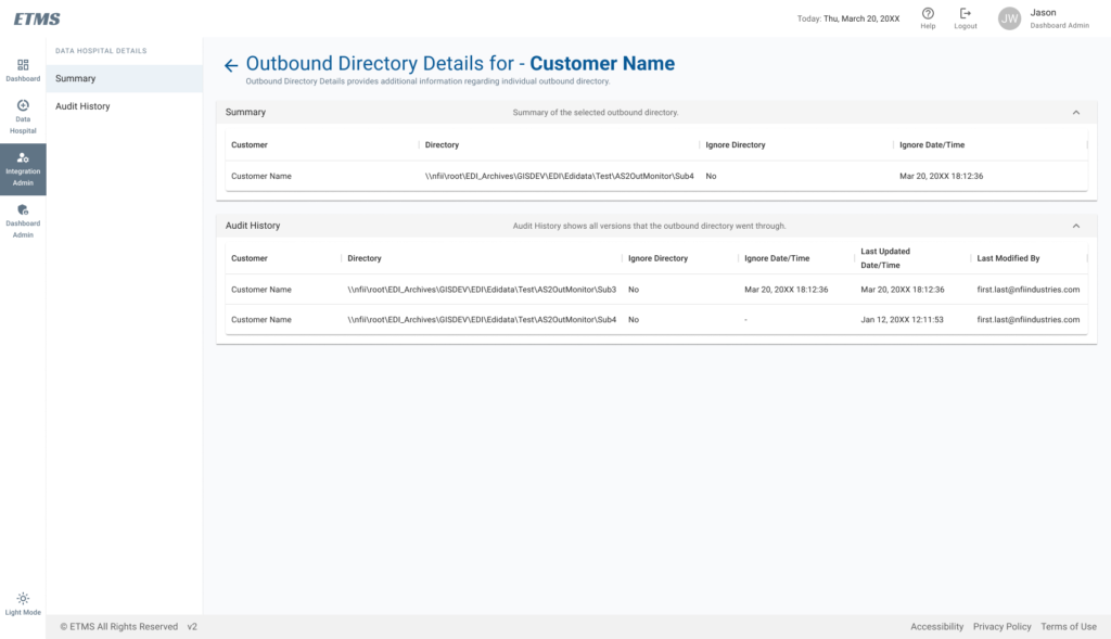
Designing Data for Rapid Scanning and Interpretation
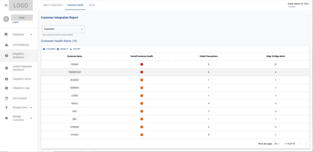
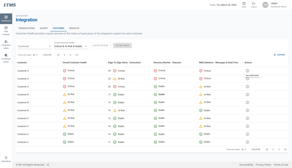
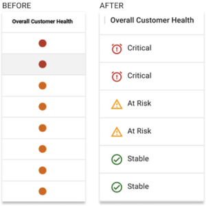
To support rapid operational decision-making, transaction data was restructured into clear, scannable tables with consistent hierarchy and status indicators.
Key system states such as critical, at risk, and stable are visually and textually reinforced, allowing users to quickly interpret system health across multiple customers and integration points.
This improved visibility enables faster identification of issues and more confident decision-making.
Enabling Platform Scalability
The redesigned interface was structured to support future platform growth. Navigation patterns, tab structures, and data tables were designed to accommodate additional modules, filters, and data attributes without disrupting existing workflows.
This scalable structure allows new pages, operational sections, and transaction data fields to be introduced as the platform evolves while maintaining a consistent user experience.
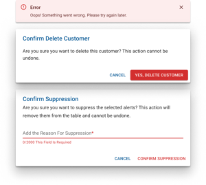
Error Prevention
Operational systems require careful handling of critical actions. Destructive operations such as clearing alerts or modifying system states require confirmation dialogs, ensuring users have an opportunity to review decisions before proceeding.
Accessibility Considerations
Accessibility improvements were implemented across the platform to improve usability in high-density data environments. Status indicators combine color with text labels to ensure clarity for users with color-vision deficiencies.
Table layouts support keyboard navigation, and consistent spacing improves readability when scanning large volumes of operational data.
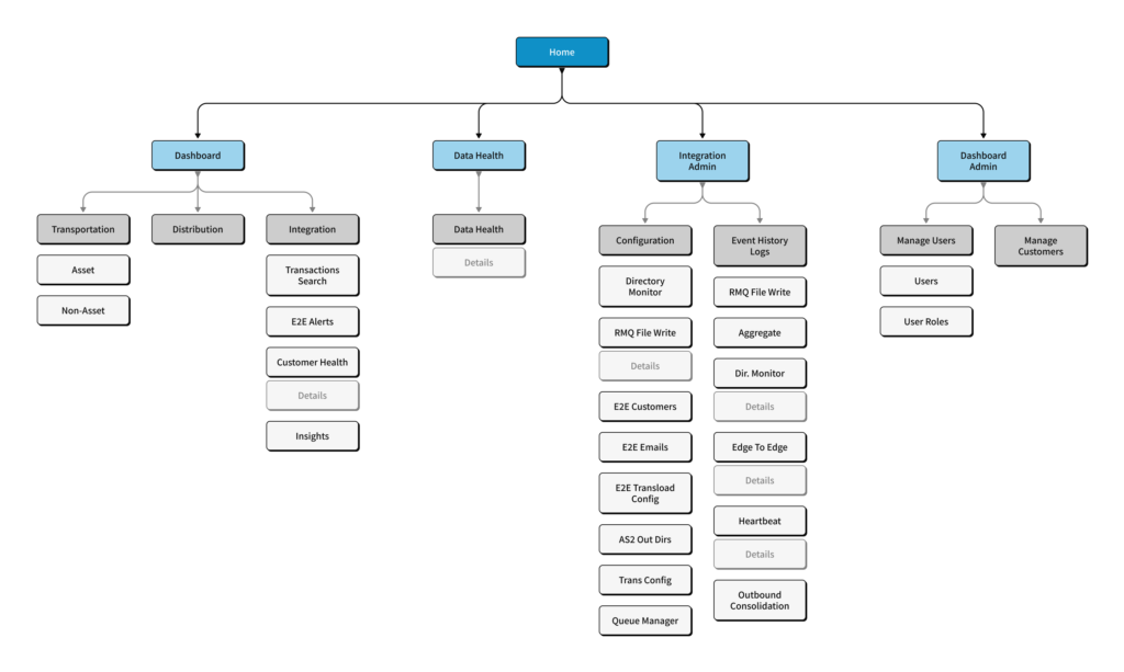
Restructuring Information Architecture
The original platform lacked a clear structure, making it difficult for users to understand system capabilities and available workflows.
I reorganized the platform into distinct operational areas, grouping related functionality and defining a scalable hierarchy that supports expanding data, features, and system complexity.
This structure enables users to navigate complex workflows more easily while supporting future system growth, ensuring the platform remains clear and usable as data volume and system complexity continue to scale.
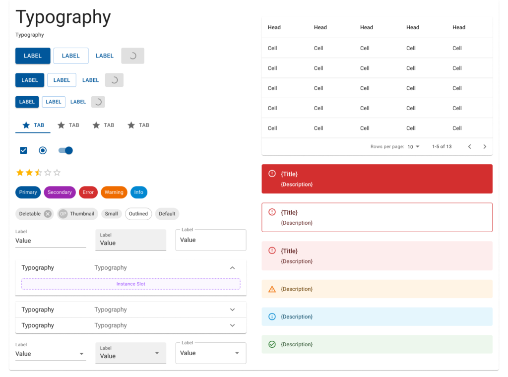
Design System & Platform Scalability
To support consistency and long-term scalability, I established a design system using MUI components and standardized interaction patterns across the platform.
This system defined reusable structures for navigation, tables, filtering, and status indicators, ensuring alignment between design and development while reducing implementation complexity.
It enabled the platform to scale across high-density data environments, allowing new features, data attributes, and workflows to be added without compromising usability or consistency.
ETMS’s design system enabled consistent interaction patterns across operational, transactional, and administrative workflows.
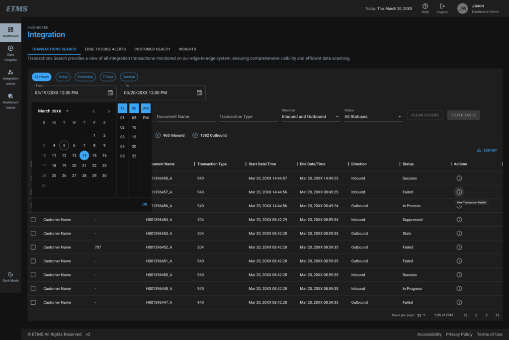
Light & Dark Modes
Designed both light and dark themes to support different working environments and improve readability in high-density data views. Both modes maintain consistent hierarchy, contrast, and accessibility standards.
VALUE
Business Impact
Increased System Adoption
Restructuring the platform’s information architecture and workflows enabled self-service usage, increasing adoption and reducing reliance on onboarding and support.
Faster Issue Identification (~30–40%)
Reduced time to detect and investigate critical system issues through improved data visibility and structured status logic.
Improved Operational Efficiency (~25–35%)
Clearer workflows and reduced cognitive load enabled operations teams to complete monitoring and investigation tasks more efficiently.
Reduced Training Dependency (~50%)
Enabled self-service workflows, significantly reducing reliance on onboarding and external support.
Scalable Platform Foundation
Established a flexible system that supports growing data complexity, enabling the addition of new tables, columns, and workflows without redesign.
Improved Accessibility & Usability
Accessible interaction patterns and clearer data presentation improved usability across high-density data environments.
NOTE: These improvements transformed the platform from an underused system into a reliable operational tool that supports daily decision-making and scales with increasing data complexity.
This project reinforced that usability alone is not enough; systems must clearly communicate their purpose. When users understand how a platform works and what actions they can take, adoption follows naturally.
REFLECTION
Lessons Learned
Designing ETMS highlighted the importance of structuring complexity, not just simplifying interfaces. The original platform failed not because of a lack of functionality, but because users could not understand how to use it or what it was designed to do.
By focusing on information architecture, system clarity, and scalable patterns, I was able to transform an underutilized system into a usable operational tool.
This project also reinforced the value of designing for scale early. As data and system complexity grow, a flexible foundation becomes critical to maintaining usability and avoiding future redesigns.
FINAL THOUGHT
My Design Philosophy
Designing ETMS reinforced my belief that great product design is not about simplifying complexity but about structuring it in a way that feels intuitive and usable.
In enterprise systems, users are not struggling with a lack of features; they are struggling with understanding. Clear information architecture, consistent patterns, and contextual guidance are what transform powerful systems into tools people can actually use.
I approach design as a balance between user needs, system constraints, and business goals, ensuring that solutions are not only usable but also scalable and sustainable over time.
Ultimately, when clarity, accessibility, and structure align, users can move with confidence, and that is where real product value is created.