Delivery tracking often exposes large amounts of carrier data but fails to answer the one question users actually have: “When will my delivery arrive?” Delivery Tracker reframes shipment visibility around clear, actionable delivery moments that help users anticipate and plan with confidence.
My Role: Product Design | 0→1 |Research | IA | Accessibility | Prototyping
Real-Time Visibility
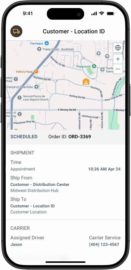
Introduced a glanceable delivery timeline that highlights key shipment moments, helping users quickly understand when a delivery is arriving without scanning complex tracking histories.
Reduced Operational Friction
Simplified authentication and tracking access so users can check delivery status instantly, reducing delays caused by account barriers and fragmented carrier systems.
Predictable Delivery Planning
Enabled store managers and customers to anticipate truck arrivals and plan staffing or availability around clear delivery milestones.
Actionable Delivery States
Reframed tracking data around a small set of meaningful delivery events, replacing dense status logs with clear, actionable shipment moments.
Project Overview
Designing for the “In-Between”
In most stores, “receiving a delivery” isn’t a desk job; it’s something an associate tries to squeeze in between helping customers and managing the floor. There is rarely a dedicated person sitting by a dock waiting for a truck.
I realized that when store teams don’t know when a shipment is coming, they can’t plan their shift. They end up reacting to a ringing doorbell at the worst possible time.
My goal for this project was to move these teams from a reactive state to a prepared one, giving them the right details at the right moment so they could get back to their actual jobs.
The Scope
While other teams handled backend systems and alert delivery, I led the design of the customer-facing experience. My focus was on how shipment updates are accessed, understood, and acted on across mobile, tablet, and desktop. This included authentication flows, shipment tracking states, and interaction patterns that support fast, confident decision-making for time-constrained users.
I had to ensure that no matter what device someone was holding or how busy they were, the information felt intuitive. It wasn’t just about making it look good; it was about making it reliable so they could make quick, confident decisions in the middle of a busy shift.
My Role
I led the design of the customer-facing delivery tracking experience, defining how shipment updates are accessed, understood, and acted upon across mobile, tablet, and desktop environments.
My work focused on simplifying delivery visibility through clear status modeling, authentication flows, and interaction patterns that support fast, confident decision-making for store teams managing deliveries in the middle of busy shifts.
WHY
The Problem
When “Where’s my stuff?” is a guessing game
In retail, a missed delivery isn’t usually an effort problem; it’s a data problem. If you’re a store associate, you’re often flying blind. You don’t have a desk, you don’t have a tracking dashboard, and you definitely don’t have time to go hunting for a tracking number in a back-office system.
When a truck doesn’t show up and you don’t know why, your whole day breaks. You’ve scheduled staff to unload a truck that isn’t there or promised a customer a pickup that hasn’t arrived. Without a way to see what’s coming, stores are stuck in a permanent state of reacting rather than planning.
The lack of reliable, accessible delivery data wasn’t just a UX issue; it was a breakdown in how operational information reached the people who needed it most.
The gaps became clear very quickly:
Information is buried: If a status exists, it’s usually locked inside a system the store team can’t access.
The “too late” alert: Getting notified after a delivery was already missed is useless.
No room for error: Real-world situations—early arrivals, delays, last-minute cancellations—weren’t accounted for.
Device friction: If it doesn’t work on a phone or handheld scanner while someone is moving, it doesn’t work at all.
The Design Challenge
My goal was to build a first-of-its-kind tracking experience for these teams. I didn’t want to give them more data to manage. I wanted to give them time back.
The challenge was delivering high-confidence information to people who are too busy to actively “track” anything.
The solution focused on four core needs:
The two-second glance: Someone should be able to look once and know whether they’re on track or in trouble.
Handling the mess: The interface needed to stay useful when things didn’t go as planned, like early arrivals, delays, or partial shipments.
Work where they work: The experience had to be fast and reliable on the devices already in their hands.
Security without the headache: Protecting shipment data mattered, but authentication had to feel almost invisible; otherwise, it wouldn’t get used.
WHAT
Research & Insights
Finding the “Information Gap” I didn’t start this project with formal personas or deep surveys. Instead, I looked at the gap between the data we had and the reality on the shop floor. What I found was a total disconnect: the logistics were there, but the store teams were flying blind.
They were relying on memory, old printouts, or frantic phone calls to guess when a truck might show up. The data existed in the system, but it wasn’t reaching the people standing on the loading dock.
What I learned from the floor:
They need the "vibe," not the spreadsheet: Store associates don’t need a full shipment manifest; they just need to know the state of the world. Is it on time? Is it late? Is it even coming? I realized that a high-level status update does more to reduce stress than a screen full of granular tracking data.
Bad timing is worse than no information:A notification that a truck was missed—sent 20 minutes after the driver left—isn't just useless; it's frustrating. My takeaway was that we had to prioritize the "lead time" so teams could actually adjust their staffing before the truck arrived.
Exceptions are the rule: Logistics is rarely linear. Trucks show up early or get canceled. I noticed that older tools treated these as "errors," which confused users. I decided the UI had to treat a cancellation or an early arrival as a standard part of the story, not an edge case.
The "Device Reality": If an associate has to walk to the back office to log into a PC, they won't use the tool. It had to work on the phone in their pocket or the scanner in their hand.
Security vs. Speed: We had to protect the data, but in a retail environment, a 30-second login process is a dealbreaker. I had to find a way to make authentication feel like a "tap" rather than a "task."
The Pivot These insights shifted my focus. It became clear that we didn’t need to build more features; we needed to build better communication. My job wasn’t just to display data; it was to deliver a “glanceable” truth that a busy manager could trust in the middle of a chaotic shift.
HOW
The Solution
Designing for the Glance
The goal wasn’t to build a “feature-heavy” dashboard. In fact, it was the opposite: I wanted to create something that stayed out of the way until it was absolutely needed. I focused on making the information “glanceable” so that a busy manager could get an answer in two seconds and get back to their customers.
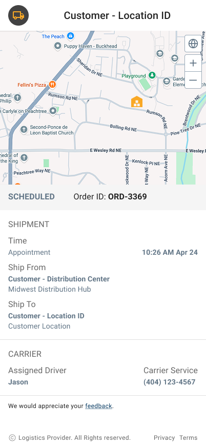
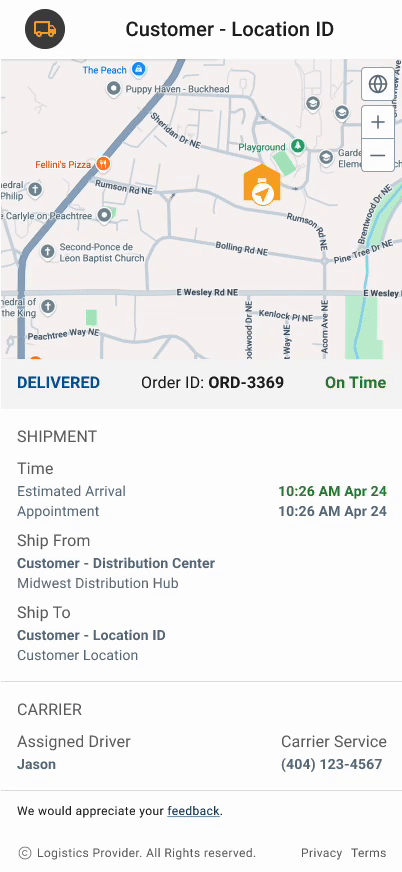
1. A simplified Delivery State Model
I moved away from raw timestamps and technical jargon. Instead, I built the UI around a few clear “delivery states” that answer one question: Do I need to do something right now?
Whether a shipment is “On Schedule,” “Delayed,” or “Canceled,” the status is the loudest thing on the screen. This removes the need for associates to do mental math to figure out if a truck is actually late.
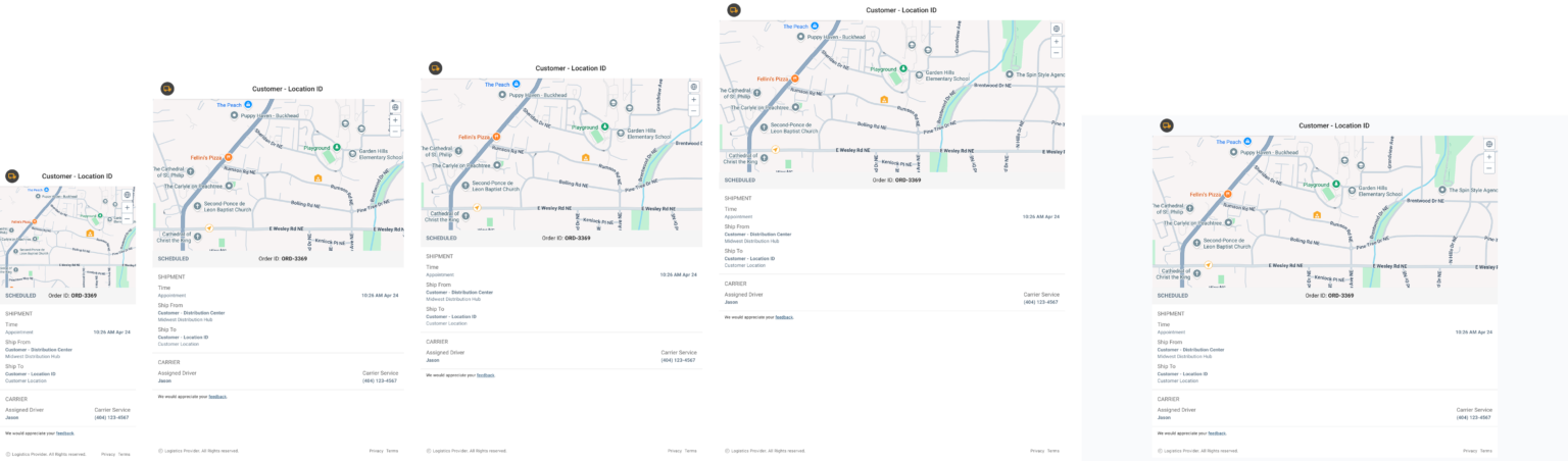
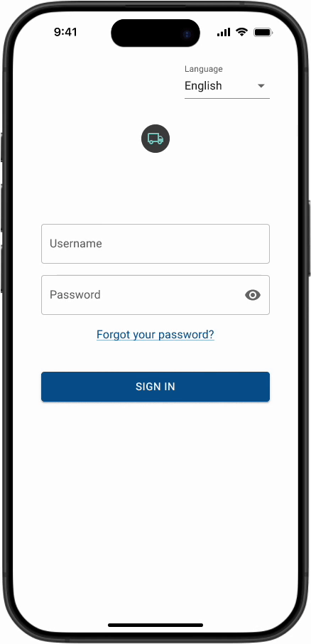
2. Designed for the Devices Users Already Have
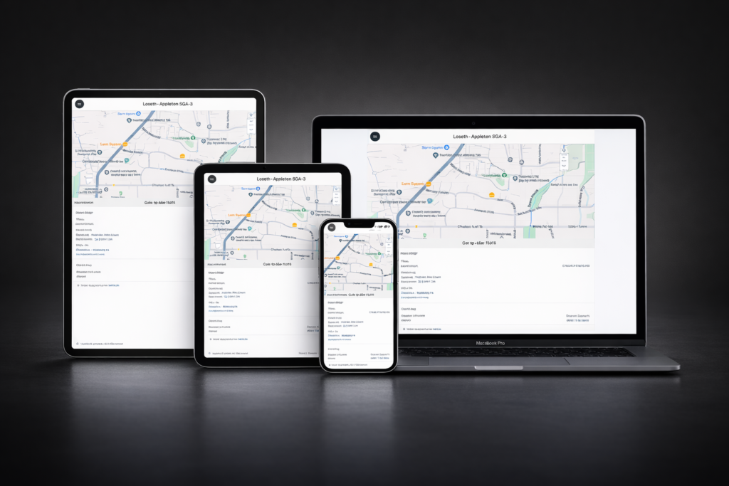
The solution was designed as a responsive, system-driven experience that supports mobile phones, iPad mini, iPad Pro (11” and 12.9”), and desktop environments. Rather than treating each device as a separate design, the interface follows shared layout rules, interaction patterns, and visual hierarchy that scale consistently across breakpoints.
Information density and spatial organization were intentionally adjusted to match how users engage with the product in different physical contexts. This approach reduces cognitive load for users while enabling teams to maintain consistency, accuracy, and performance across devices.
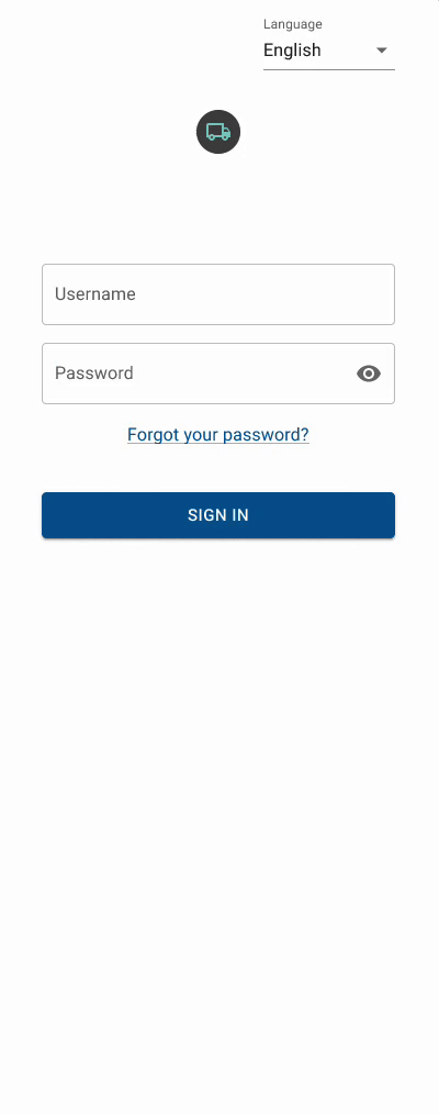
3. Balancing Security with Speed
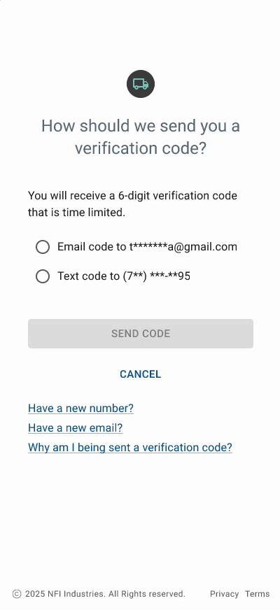
Protecting shipment data while minimizing friction was one of the core tensions in this project. A traditional username-and-password model would have added unnecessary overhead for store associates who need fast, reliable access throughout the day.
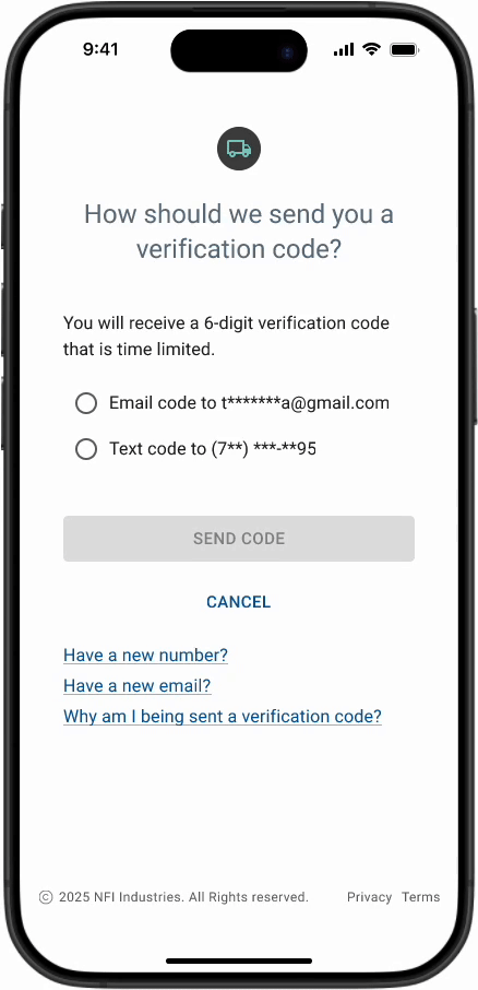
To address this, I designed a one-time verification code flow that treats authentication as a quick confirmation rather than a multi-step task, allowing users to move through the experience with minimal interruption. I explored two variations of this flow to balance usability and security in different contexts.
The first version emphasizes flexibility, providing clear recovery paths such as resending codes, updating contact information, and explaining why verification is required.
The second version introduces a visible expiration timer and stricter validation to increase clarity around time-sensitive access and reduce ambiguity when codes expire.
Together, these approaches reflect a deliberate tradeoff: prioritizing speed and clarity for associates while keeping sensitive shipment data behind a secure, controlled access layer.
Version 1
Version 2
4. SMS as a Bridge
We decided to lean heavily on proactive SMS updates. I wanted to move from “reactive” (finding out later) to “proactive” (knowing ahead of time).
Each text contains a direct link that bypasses the need for the user to hunt through an app or search for a tracking number. It takes them straight to the context of that specific order.
5. System & Developer Experience (DX)
Although this case study focuses on the customer-facing experience, the design was shaped by an awareness of the systems behind it.
Delivery states were intentionally modeled as discrete, predictable events. This reduces conditional UI logic, supports reliable notification triggers, and simplifies integration with external services.
Clear state definitions also make it easier for engineering teams to reason about edge cases, error handling, and future expansion.
By aligning the UX model with how systems process events, the experience remains consistent for users while reducing complexity for developers.
VALUE
Impact
While this project didn’t end up shipping, the work itself became a blueprint for how we think about operational friction. It moved the conversation away from “How much data can we show?” to “How much time can we save the user?”
Even without live metrics, the design phase acted as a forcing function for our team. It clarified how a “glanceable” approach could have changed the day-to-day for a store manager, moving them from a reactive scramble to a place where they could actually plan their staffing around a truck’s arrival.
What we walked away with:
A New Standard for Clarity: We proved that limiting delivery states to a few "actionable" moments was far more valuable than a deep-dive tracking history.
Operational Confidence: The work showed that reducing "authentication friction" wasn't just a UX win; it was a requirement for adoption in high-pressure environments.
A Shared Language: For the first time, design, product, and engineering were aligned on what "good" looks like for delivery data. We moved away from technical jargon and toward a shared model of discrete, predictable events.
Strategic Validation: The project validated a core belief: that in logistics, timing and accessibility beat a high volume of data every time.
Ultimately, this work created a foundation. It challenged our internal assumptions about how much “security friction” a busy user can tolerate and established a design pattern that the team continues to use as a reference point for future shipment-related features.
This work reminded me that good design isn’t about adding features; it’s about removing uncertainty at the moments that matter most.
Final Prototypes
Delivery Tracker
Auth Version 2
Auth Version 2
Delivery Tracker Responsive & Multi-devices
REFLECTION
Lessons Learned
Simplicity is a constant battle. In logistics, there’s always a temptation to show more data in the name of “accuracy.” But I realized that for a store associate, more data usually just leads to more hesitation. Every time we debated adding another detail, I had to ask, “Does this actually help them make a decision, or is it just noise?” I learned that by stripping the UI down to only the states that drive action, we actually built more confidence than a “detailed” spreadsheet ever could.
Design for the “mess,” not the “happy path.” It’s easy to design a tracking bar that goes from A to B. It’s much harder to design for a truck that shows up three hours early or a shipment that gets canceled while it’s on the road. This project reminded me that users need us most when things go wrong. If the system only works when everything is perfect, it’s not actually a tool; it’s a liability.
Trust is built in the small moments. I spent a lot of time thinking about the friction of authentication and the tone of our error messages. If a manager is stressed and the app locks them out or gives them a cryptic error code, we’ve lost their trust. I learned that “security” isn’t just about encryption; it’s about how quickly we can help a user get back to work without making them feel like the system is fighting them.
The value of restraint. Working with these real-world constraints was a lesson in saying “no.” When you know your user is multitasking and moving through a busy stockroom, your biggest contribution as a designer is often what you choose not to include. We stayed focused on one goal: helping them prepare for the truck, not just react to the doorbell.
FINAL THOUGHT
My Design Philosophy
This project reflects how I approach product design in complex, real-world environments. I believe meaningful design lives at the intersection of empathy and systems thinking, where understanding how people actually work is just as important as understanding how the system behind the interface behaves.
My goal is to create experiences that feel dependable under pressure. That means designing for clarity over completeness, prioritizing what users need to know now rather than everything they could know, and shaping interfaces that support quick decisions instead of prolonged attention.
I’m especially drawn to problems where trust is built through small, intentional details. Whether it’s how a status change is communicated, how an error is explained, or how quickly someone can regain access, these moments define how reliable a product feels over time.
Ultimately, I see design as a way to reduce friction not just for users but for teams as well. When the UX aligns with real workflows and underlying systems, products become easier to use, easier to build, and easier to evolve. That alignment between people, process, and technology is what I aim to bring to every project.