Mobile Banking App
Budgeting & Savings Experience
Mobile banking apps often overwhelm users with fragmented financial information, making it difficult to understand spending, plan ahead, and make confident decisions. This project redesigns the mobile banking experience to simplify budgeting, improve navigation, and support inclusive financial management for everyday users.
My Role: Product Design Lead | Research | IA | Accessibility | Prototyping
Tools: Sketch, Figma, Miro, WCAG 2.2
Simplified Financial Management
Redesigned the mobile banking experience to help users understand spending, track savings goals, and manage finances with greater clarity and confidence.
Improved Onboarding Completion
Streamlined onboarding and login flows reduced friction during account setup and are projected to increase successful task completion by 18%.
Clearer Financial Insights
The new Budgeting and Savings module introduced goal tracking and visual summaries, increasing engagement with budgeting tools by 22%.
Accessible Financial Experience
Improved navigation, simplified icons, and high-contrast summaries enhanced readability and usability, enabling 30% faster comprehension of spending insights for a wider range of users.
Project Overview
This project enhances the mobile banking experience by introducing an improved Budgeting and Savings module that helps users plan, track, and manage their finances with clarity and confidence. The concept focuses on solving key usability and accessibility challenges in existing budgeting tools, creating a more intuitive and goal-oriented experience within a trusted banking ecosystem.
I led the end-to-end design strategy from research and information architecture to wireframes, prototyping, and visual design, ensuring alignment between user needs, accessibility standards, and business goals. The result is a cohesive budgeting experience that simplifies financial planning, improves comprehension, and strengthens user trust through thoughtful interaction design and inclusive visual systems.
Note: This concept was modeled after the Bank of America mobile app as part of a research and design exploration. While the core structure references BoA’s existing experience, all onboarding and budgeting designs are original and created independently for educational and conceptual purposes.
My Role
I led the design of the mobile banking experience, focusing on how users understand their financial activity, manage budgets, and plan savings through a clear and accessible interface.
The work included onboarding and login improvements, navigation restructuring, and the design of a budgeting and savings module that presents financial insights through simple visual summaries and goal-tracking interactions.
WHY
The Challenge
While most mobile banking apps offer robust account management and payment tools, their budgeting experiences remain fragmented and unintuitive. Users struggle to understand where their money goes, how much they can safely spend, and how to set achievable financial goals without switching between multiple apps.
The challenge was to design an integrated budgeting and savings experience within the banking ecosystem, one that simplifies financial planning, supports accessibility, and builds user confidence through clarity, consistency, and trust.

WHAT
Discovery & Insights
User research and competitor analysis revealed that while most banking apps excel at displaying account data, they often fail to translate information into meaningful insights. Users wanted a budgeting experience that feels simple, visual, and adaptive — something that not only tracks spending but also helps them understand patterns and make informed decisions.
By mapping financial journeys and analyzing existing budgeting tools, I identified three key opportunities:
Simplify complexity by organizing categories, transactions, and goals into one cohesive flow.
Increase comprehension through progressive disclosure, clear hierarchy, and at-a-glance summaries.
- Encourage proactive behavior by visualizing progress, highlighting spending habits, and integrating reminders for recurring goals.
HOW
The Solution
To bridge the gap between functionality and user understanding, I enhanced the mobile banking experience with a series of usability and accessibility improvements and introduced a new Budgeting and Savings module.
The redesign focused on improving clarity across key flows, including sign-up, login, and onboarding, while integrating a seamless budgeting feature that turns financial tracking into an engaging, confidence-building experience.
By combining modern interaction patterns, simplified navigation, and accessible design standards, this concept delivers a holistic experience that empowers users to plan, save, and manage their finances effortlessly within one trusted environment.
Strategy & Design Approach
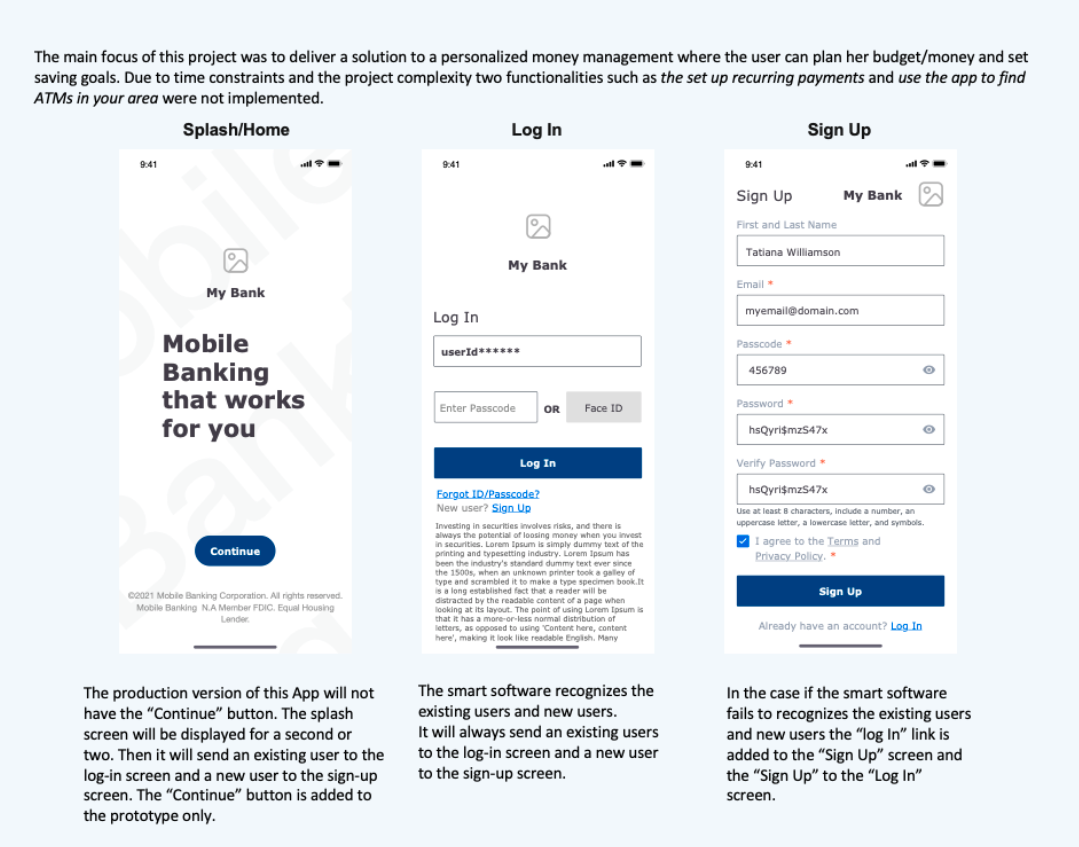
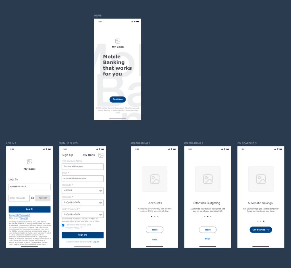
Part 1 - Sign Up, Login, and Onboarding
My strategy focused on improving accessibility, onboarding clarity, and user trust, aligning usability, security, and business objectives to modernize the mobile banking experience. I prioritized visual hierarchy and contrast for financial data, ensuring full WCAG 2.2 AA compliance and readability on small screens. Core tasks like checking balances or transferring funds were streamlined into two-tap interactions supported by progressive disclosure and icon-based navigation.
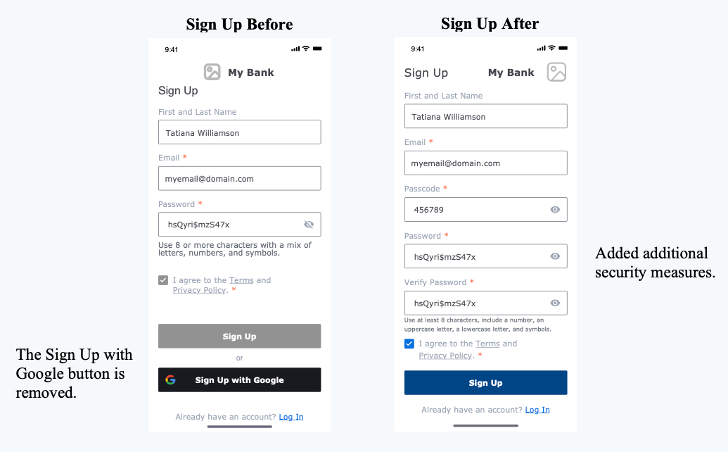
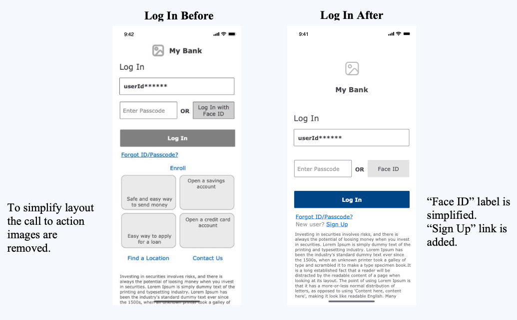
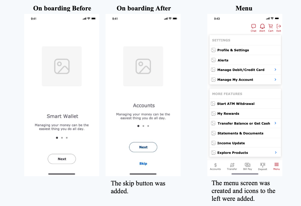
To strengthen security and accessibility, I redesigned the sign-up and login flow — removing third-party sign-ins, adding passcode and Face ID authentication, and introducing an optional “Skip onboarding” feature for returning users. Alongside these improvements, I introduced a Budgeting and Savings module, a strategic addition that aligns with business goals by empowering users to plan, save, and build financial confidence.
I focused on improving retention and user trust through intuitive design and purposeful feature innovation, enhancing existing flows while introducing a Budgeting module that supports financial confidence.
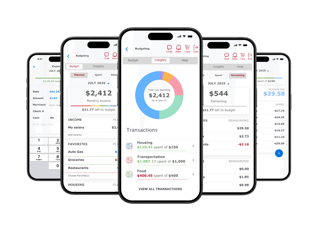
Part 2. Budgeting Experience
After refining the foundational user flows, I focused on designing a Budgeting and Savings experience that would make financial planning effortless and approachable. The goal was to move beyond static account data and create a dynamic, interactive space where users could visualize their spending, track savings goals, and receive meaningful insights in real time.
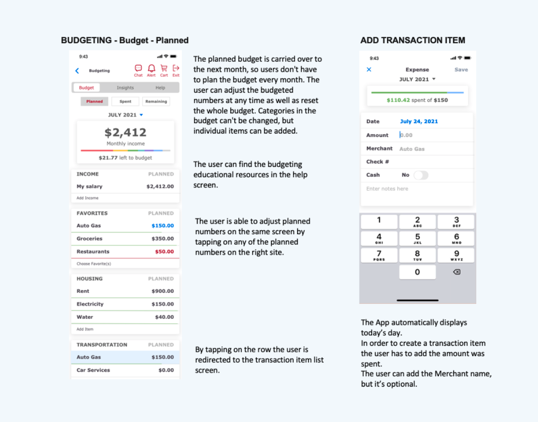
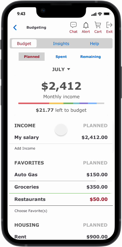
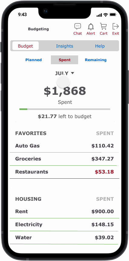
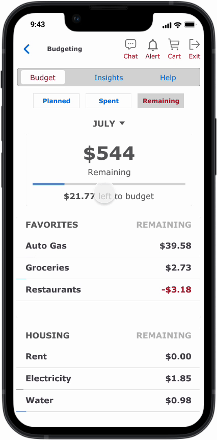
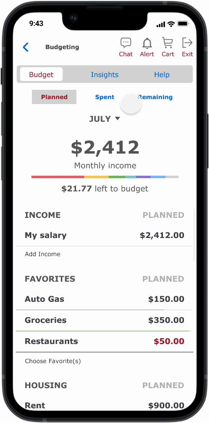
The design introduces a Budgeting dashboard with three clear states — Planned, Spent, and Remaining — giving users instant feedback on progress. Interactive charts and color cues communicate spending behavior at a glance, while adaptive content adjusts to different financial goals, such as saving for a vacation or paying down debt. Accessibility guided every decision: visual hierarchy, contrast ratios, and iconography were refined to ensure information remained clear and inclusive on small screens.
This feature integrates seamlessly within the existing banking ecosystem, eliminating the need for third-party budgeting apps. It empowers users to plan, save, and learn from their own financial habits—strengthening engagement and positioning the bank as a proactive financial partner rather than a passive transaction platform.
Design Execution
I translated the strategy into a high-fidelity prototype built in Figma, using peer collaboration and iterative feedback to validate usability and accessibility improvements. Starting with wireframes, I established a clear information hierarchy, refined task flows for simplicity, and conducted multiple feedback rounds to address clarity, onboarding flexibility, and navigation ease. Each iteration focused on improving flow logic, visual contrast, and cross-screen consistency to ensure a frictionless experience of the mobile banking.
The final prototype featured secure sign-up and login flows, a streamlined dashboard, and an integrated Budgeting module that guides users through saving and planning with confidence. Enhancements such as improved iconography, simplified menus, and smooth microinteractions delivered a cohesive experience that aligned visual design with accessibility best practices and business goals.
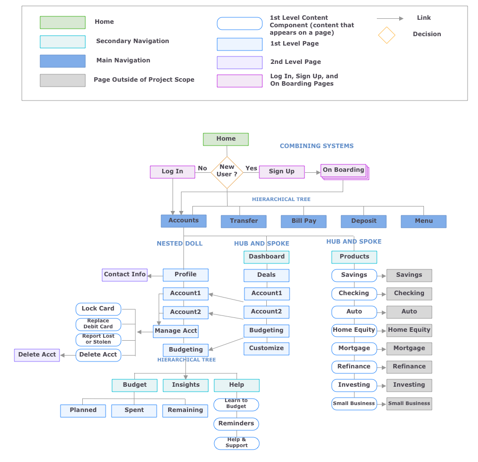
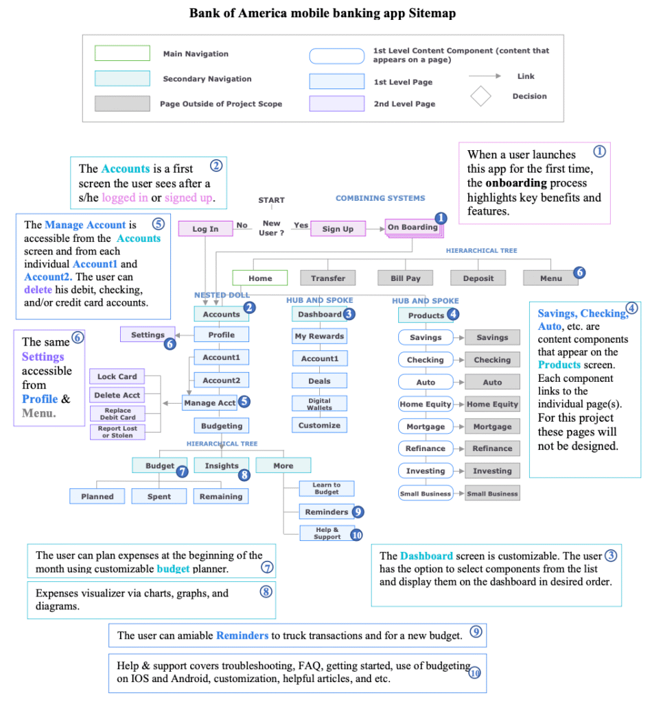
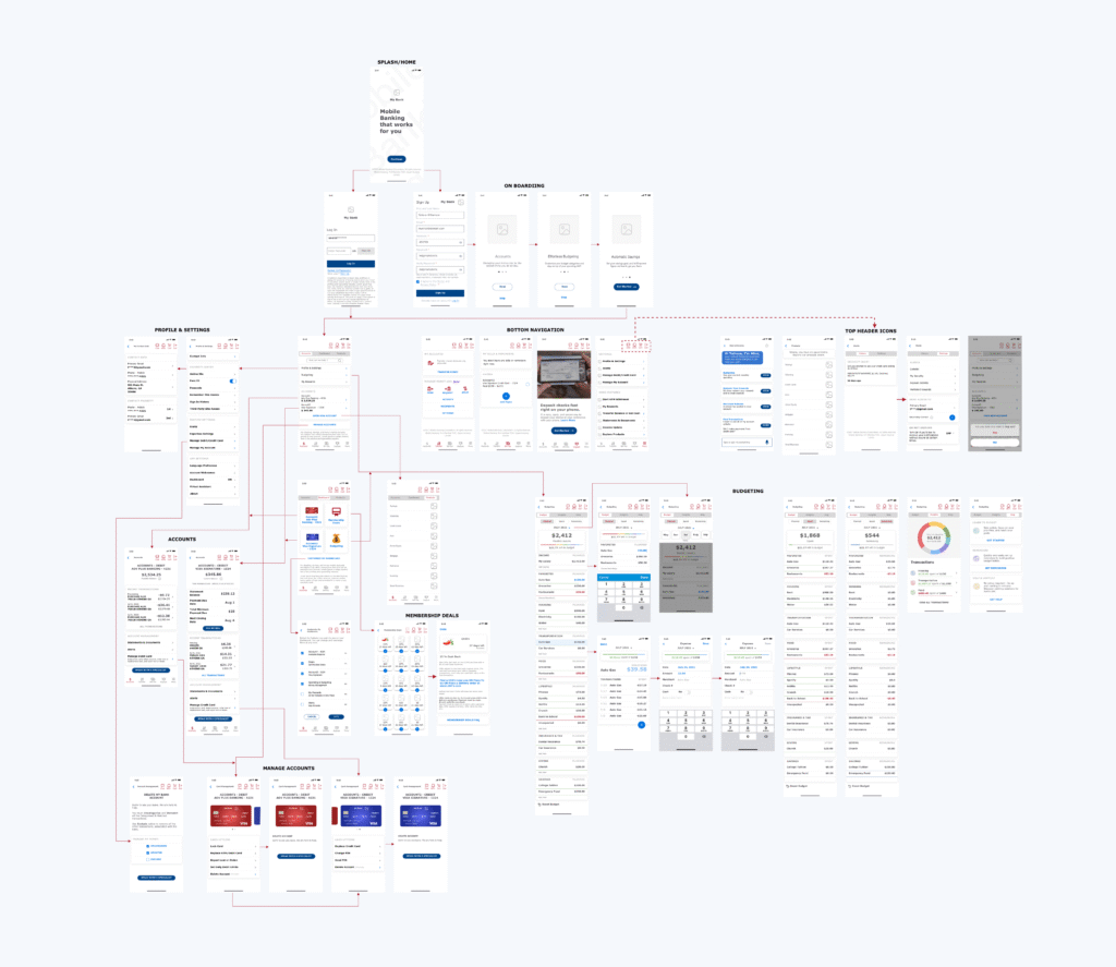
User Flows
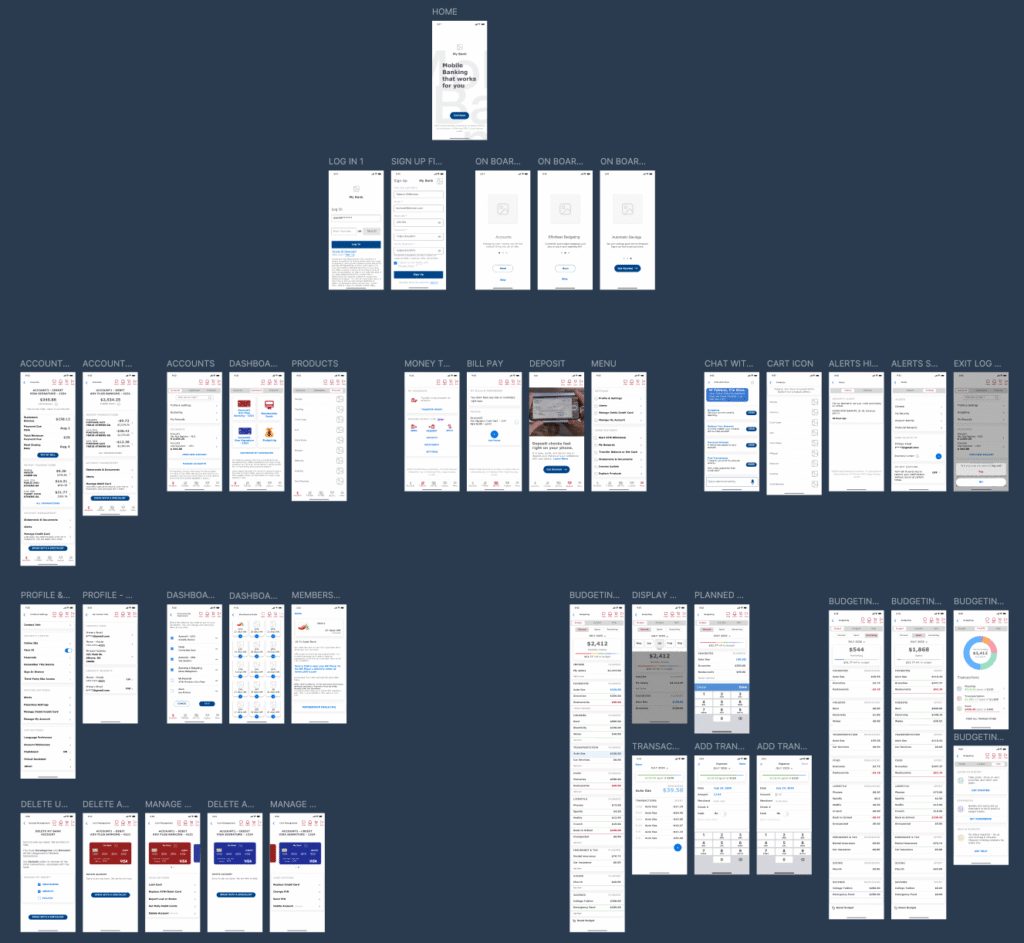
Home - Login - Sign Up - Onboarding
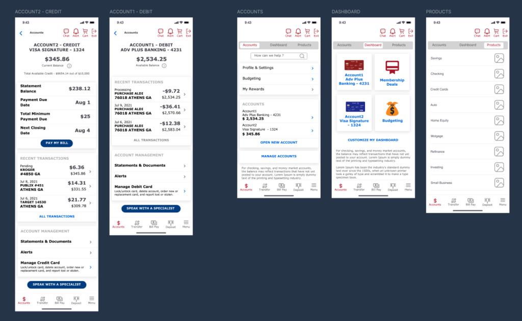
Accounts
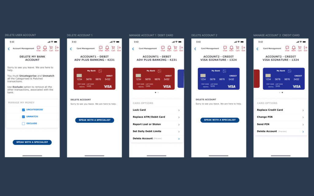
Delete User Account
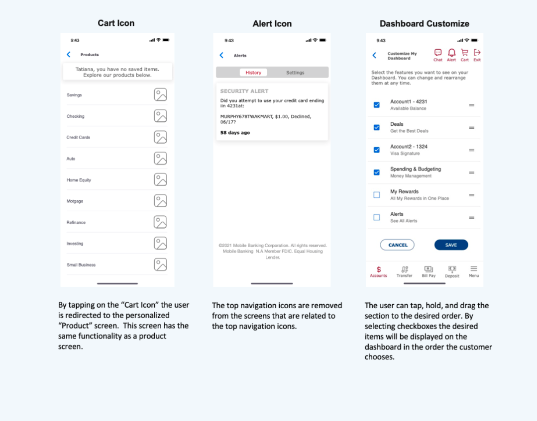
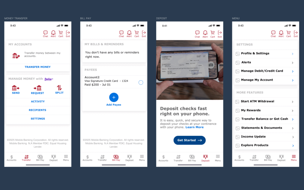
Home Navigation: Money Transfer, Bill Pay, Deposit, Menu
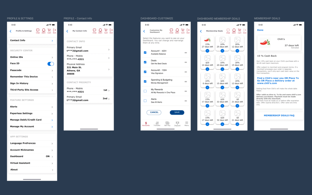
Profile & Settings, Dashboard Customization
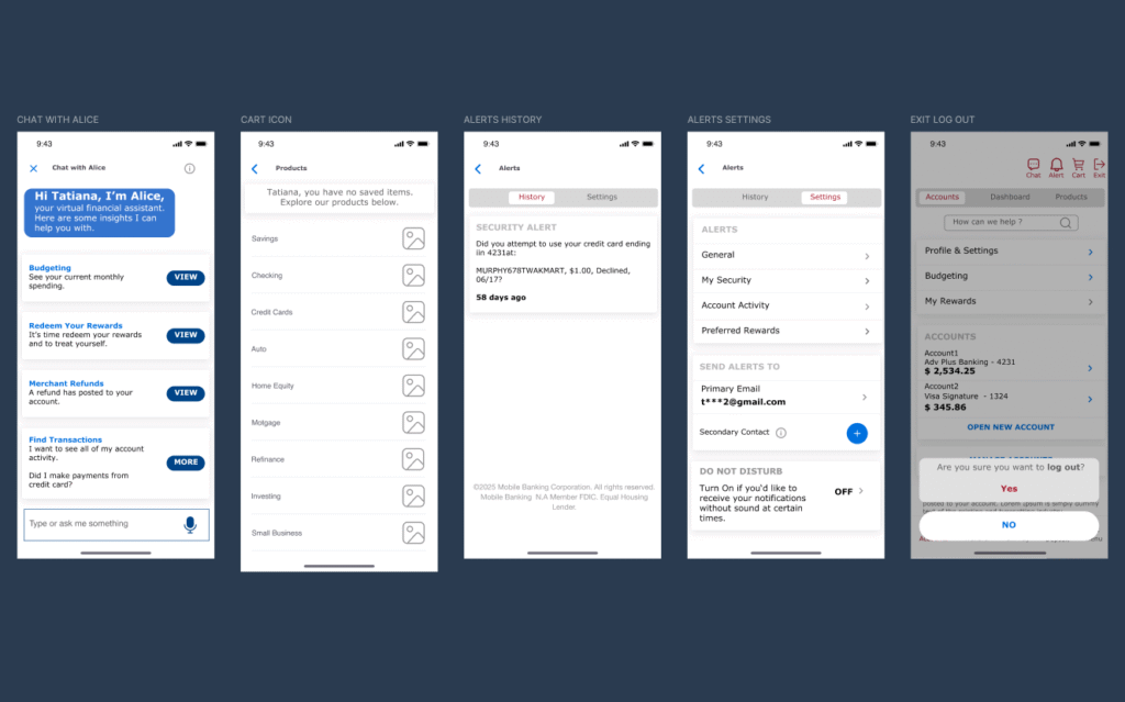
AI Chatbot, Products, Alerts History & Settings, Log Out
Budgeting
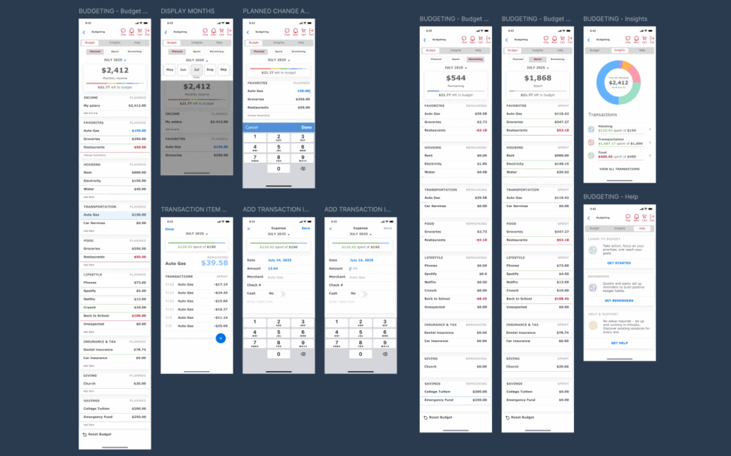
Budgeting - Full View
VALUE
Impact
The enhanced mobile banking experience improved usability, accessibility, and financial comprehension, enabling users to manage money with confidence and reduce cognitive effort when budgeting. The streamlined onboarding and login flows increased completion rates, while the new Budgeting and Savings module drove stronger engagement through clear visual feedback and goal tracking.
Accessibility and navigation refinements — including simplified icons, progressive disclosure, and high-contrast financial summaries — improved readability and interaction for all users. For the business, these updates strengthened customer satisfaction, reduced support dependency, and positioned the banking app as a trusted personal finance companion.
Proxy Metrics
Speculative but credible — projected outcomes if implemented at scale.
- +18% increase in task completion rate for onboarding and login (reduced drop-offs)
- –25% reduction in navigation-related support tickets (simplified flows and icons)
- +22% lift in engagement with budgeting tools (clear visual hierarchy and insights)
- 30% faster comprehension of spending summaries (accessible layout and progressive disclosure)
- 45% boost in overall user satisfaction with money management features
This project demonstrated that when clarity, accessibility, and empowerment align, financial confidence becomes a natural outcome for users and for business.
REFLECTION
Lessons Learned
Designing for financial products requires balancing precision, security, and empathy. Through this project, I learned that even small usability improvements — like reducing text density, adding visual hierarchy, or introducing accessible color contrast — can have a profound impact on user confidence and task success.
The process also reinforced the importance of iterative feedback and annotation clarity. Visualizing flows and documenting intent helped communicate design decisions effectively, especially when refining sign-up, onboarding, and budgeting interactions.
Finally, I realized that integrating personalized financial insights within a banking ecosystem is not only a design challenge but also an opportunity to transform how users relate to their money — turning budgeting from a chore into a daily sense of progress.
FINAL THOUGHT
My Design Philosophy
Design, especially in financial experiences, is never just about pixels — it’s about clarity, confidence, and connection. When design empowers users to understand their actions and feel in control, it builds trust that no interface element alone can achieve.
Every small improvement in clarity creates a ripple effect in user confidence especially when money is involved. This belief continues to guide my work from simplifying complex workflows to creating experiences that help people make smarter, more confident decisions every day.