Global Video Streaming Platform
Subscription & Payments
Global streaming platforms must support subscriptions, payments, and account management across diverse markets with different languages, currencies, and billing systems. This project explores how a unified subscription experience can reduce friction for international users through localized pricing, multilingual interfaces, and multi-currency payments.
My Role: Product Design | 0→1 | Research | Design Systems | Prototyping
Reduced Subscription Friction
Simplified the subscription flow to improve usability and plan clarity, enabling users to complete sign-ups faster with fewer drop-offs during plan selection and account creation.
Improved Payment Conversion
Clear pricing structures and streamlined checkout interactions were projected to increase successful payments by 12%, reducing abandonment during the payment step.
Global Accessibility & Localization
Localization improvements — including RTL support, Chinese optimization, and dark mode — expanded usability for international audiences across diverse markets.
Scalable Payment Architecture
Consistent design patterns enabled faster integration of new payment methods, reducing implementation time by 30% while supporting multi-currency billing and localized pricing.
Project Overview
This case study explores the design of a seamless, scalable subscription experience for a global video streaming platform.
The goal was to create a flow that feels intuitive across devices and markets, while reducing friction in plan selection, account setup, and payments.
By addressing challenges like localization and payment recovery, the project aimed to increase subscriber trust, retention, and global accessibility.

My Role
I led the design of the subscription and payment experience, focusing on how users discover plans, understand pricing, and complete sign-ups across global markets.
The work explored subscription plan comparison, account creation and checkout flows, localization for multi-language and multi-currency environments, and accessibility considerations that support a diverse international audience.
WHY
The Problem
Streaming platforms promise convenience, but for many users the subscription experience feels anything but simple. The result? A subscription journey that feels fragmented, unreliable, and costly — for both users and streaming companies.
Confusing Plans
Imagine trying to choose a plan — “Basic, Standard, Premium, Ad-supported…” Which one is really right for you? Many users struggle to compare benefits and end up picking the wrong tier, or abandoning sign-up altogether.
Subscription Overload
Households now juggle 3–5 different streaming services. People often forget what they’re subscribed to or cancel right after binge-watching a single show. Managing subscriptions has become stressful instead of seamless.
Payment Frustrations
Cards expire, banks decline charges, or payment systems glitch. Users don’t even realize their subscription failed — until they’re locked out mid-show. This leads to accidental cancellations and frustration.
Global Limitations
For international users, the process is even harder. Limited currency options, weak translation, and inconsistent pricing leave many feeling excluded or forced to hack workarounds. As a result, many users miss out on opportunities.
WHAT
Research & Insights
To understand the challenges behind subscriptions and payments, I looked at industry reports, user behavior studies, and market trends. Here’s what I found:
- Users are overwhelmed by choice. A 2024 survey showed that 31% of households felt overloaded by the number of streaming subscriptions they manage. Many admitted they didn’t even know what they were paying for.
- “Subscribe-binge-cancel” behavior is common. Users often sign up to watch a single show, then cancel once it ends. This creates high cancellation rates and constant churn for streaming companies.
These insights shaped my design approach: focus on clarity, flexibility, and global inclusivity.
- Involuntary cancellations cost millions. Studies show that billing failures (expired cards, insufficient funds, lost payment methods) account for a large portion of subscription drop-offs. These aren’t intentional — but they drive users away anyway.
- Global users face extra barriers. Limited multi-currency support, weak localization, and unclear tier pricing make it harder for international customers to subscribe and stay subscribed.
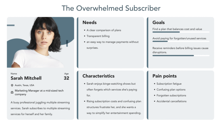
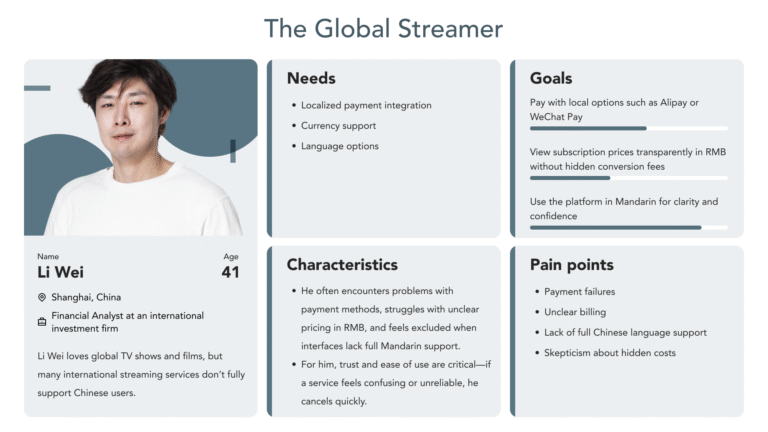
Personas
To ensure the subscription experience addressed diverse user needs, I created two key personas representing the most common challenges: the Overwhelmed Subscriber and the Global Streamer.
These personas were developed by analyzing industry research, user behavior patterns, and subscription pain points.
They served as north stars throughout the design process, keeping the focus on real-world frustrations and expectations rather than abstract assumptions.
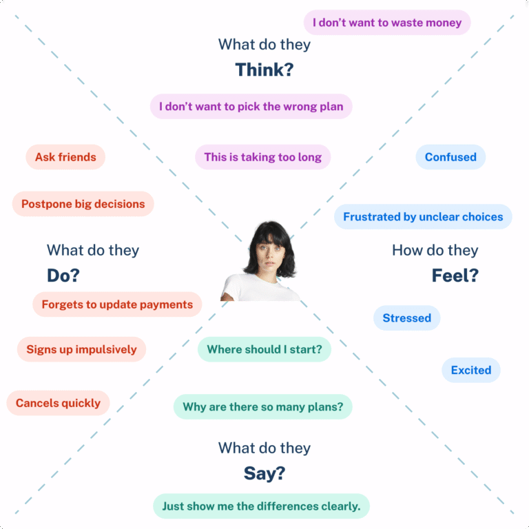
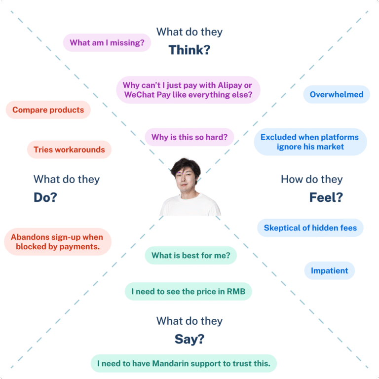
User Empathy Map
To better understand the context, emotions, and motivations behind these users, I mapped out their experiences using empathy maps.
This helped understand better what users think, feel, do, and need in critical moments—such as choosing a plan or updating a payment method.
These maps revealed opportunities to design a simpler, more transparent, and more inclusive subscription flow.
HOW
The Solution
Based on these insights, I designed a seamless subscription and payments experience that simplifies plan selection, integrates localized payments, and ensures transparency at every step.
The design focuses on creating trust, reducing friction, and making global access effortless, no matter the user’s language, device, or location.
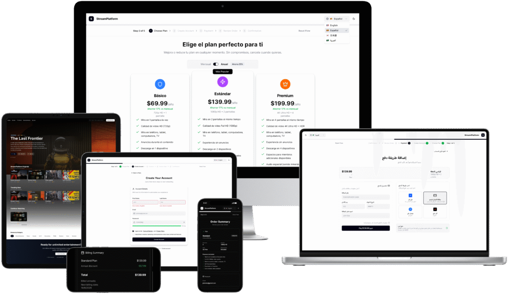
The experience unfolds through five main steps, each designed to guide users effortlessly from curiosity to confirmation: 1. Plan Selection, 2. Account Creation, 3. Payment & Localization, 4. Preview Order, 5. Confirmation.
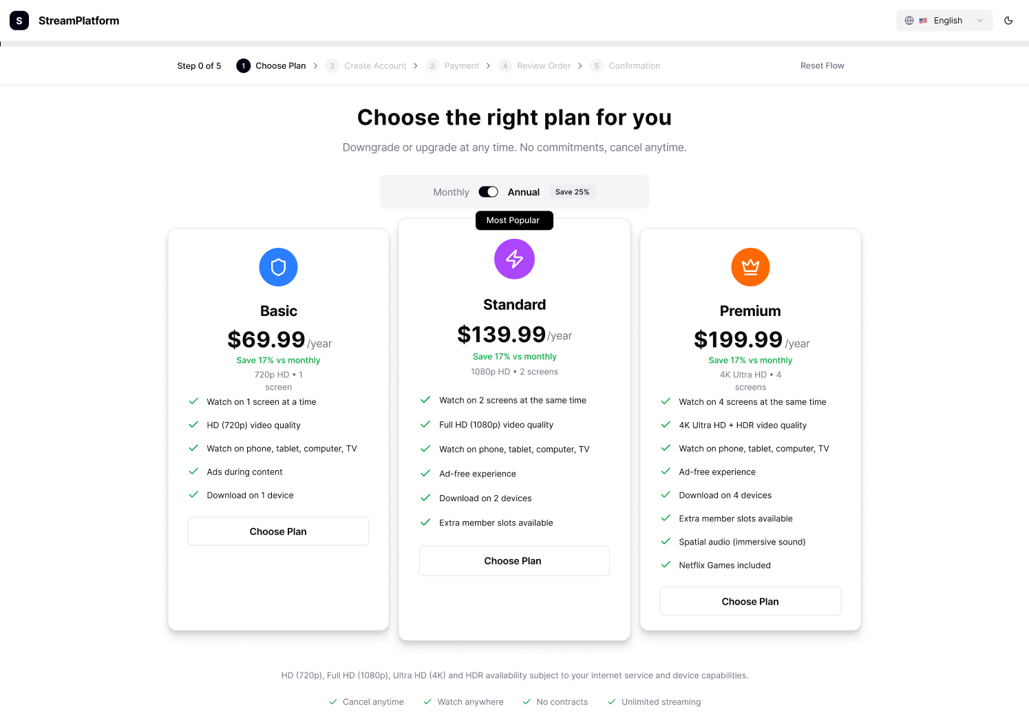
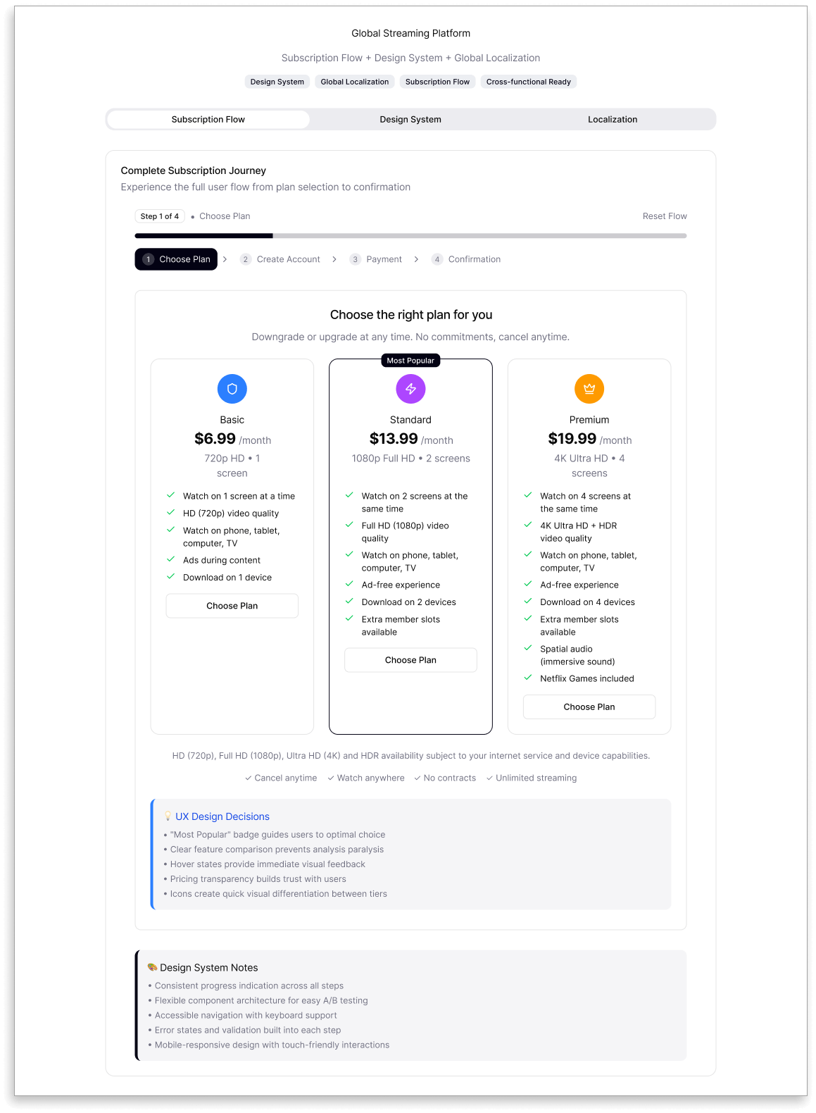
1. Plan Selection
Designing the subscription step wasn’t just about creating a pricing table, it was about guiding users toward the right choice with clarity, inclusivity, and confidence.
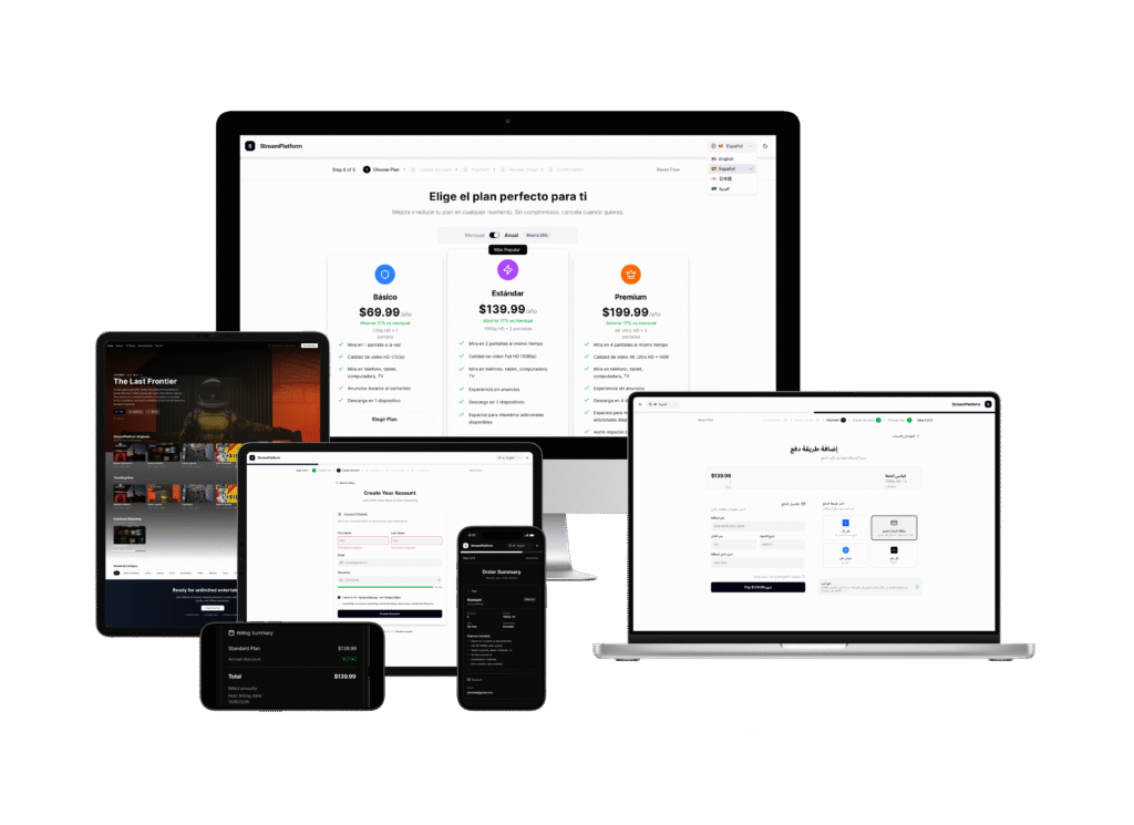
My goal was simple yet ambitious: to craft a layout that feels intuitive across devices, accessible in both light and dark modes, and adaptable to four global languages English, Spanish, Chinese, and Arabic.
Because this step plays a key role in conversion, every design decision was intentional. Each element built to support both user understanding and business goals.
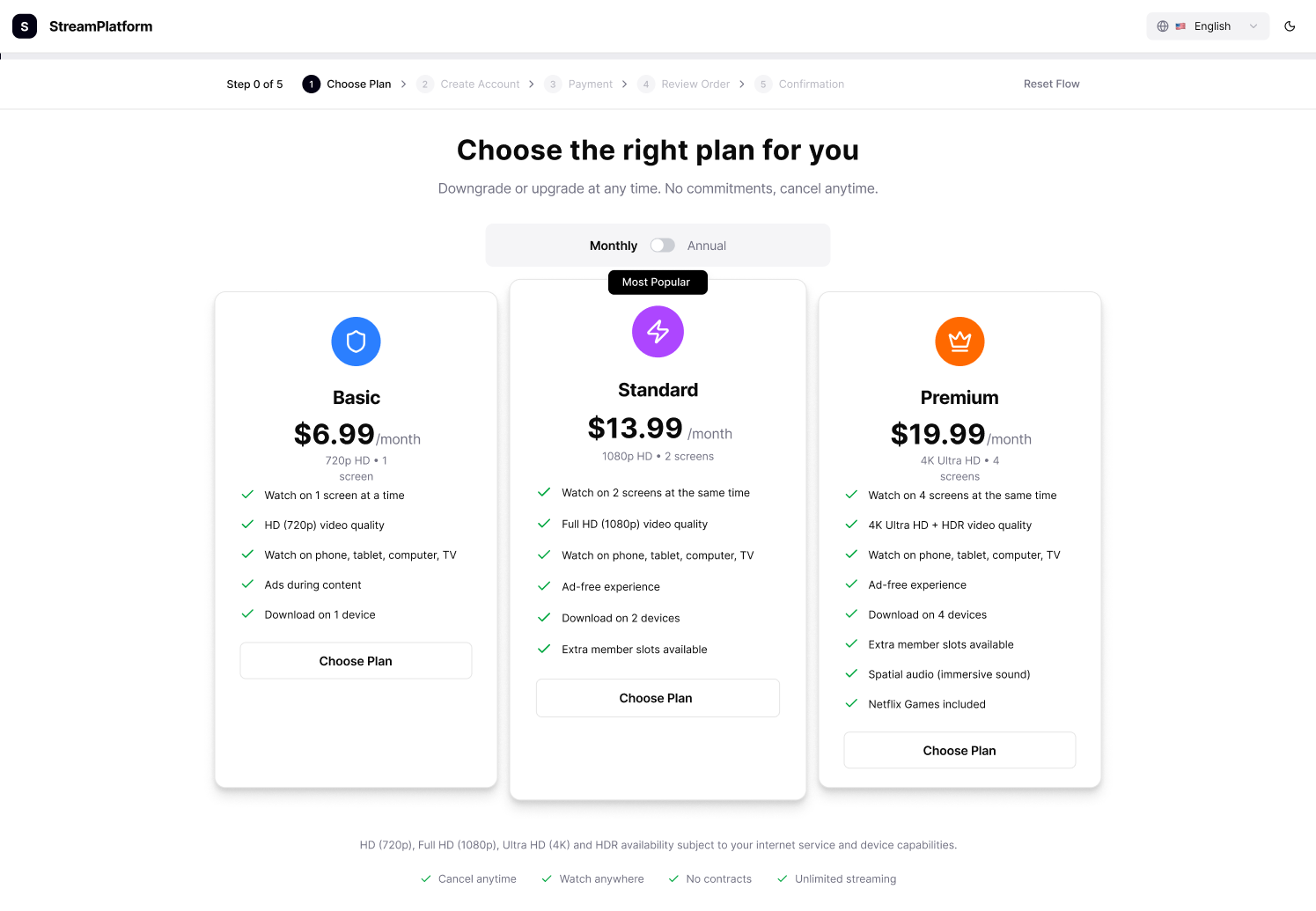
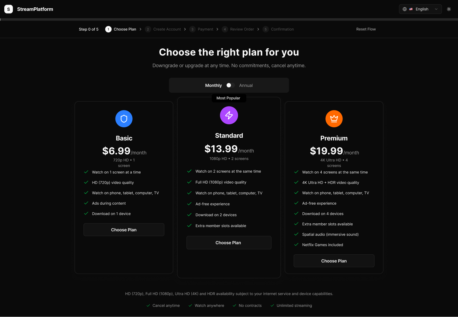

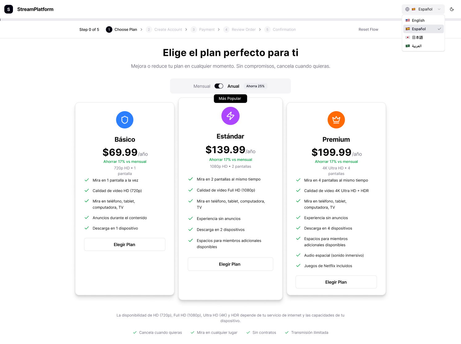
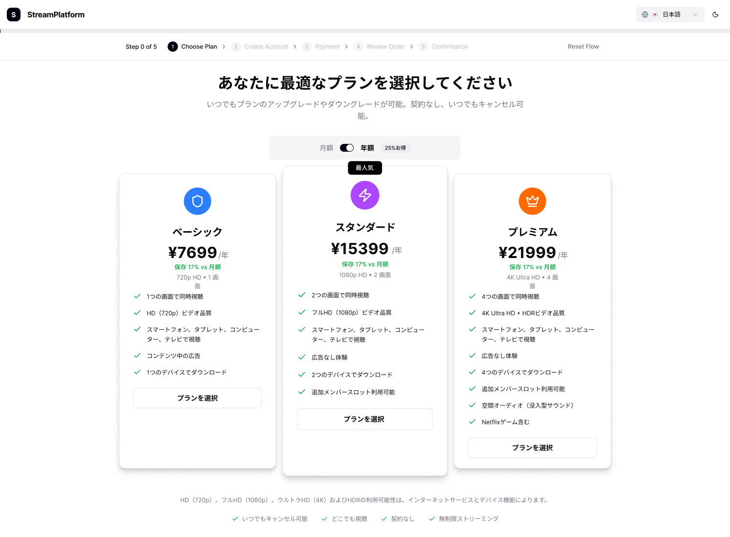
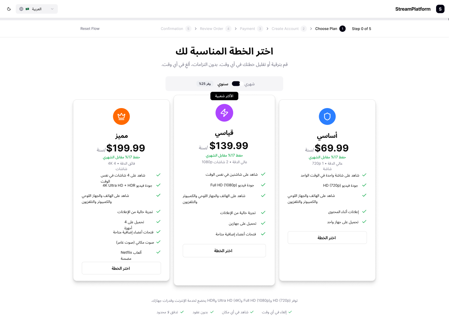
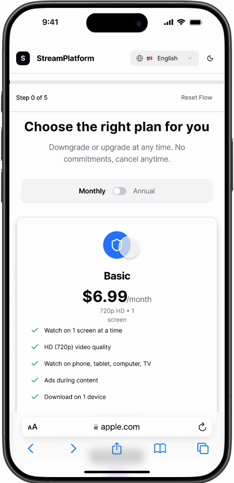
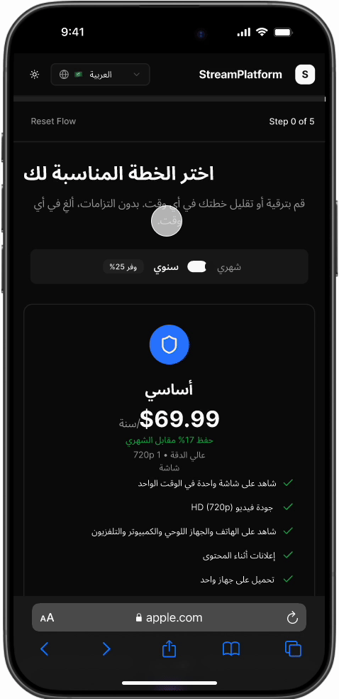
Here’s a closer look at the final layout, designed for clarity, readability, and effortless comparison between plans. Exploring consistency across themes, devices, and languages, ensuring accessibility and inclusivity for global users.
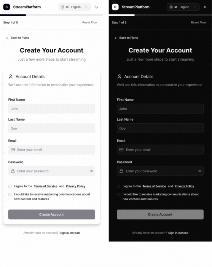
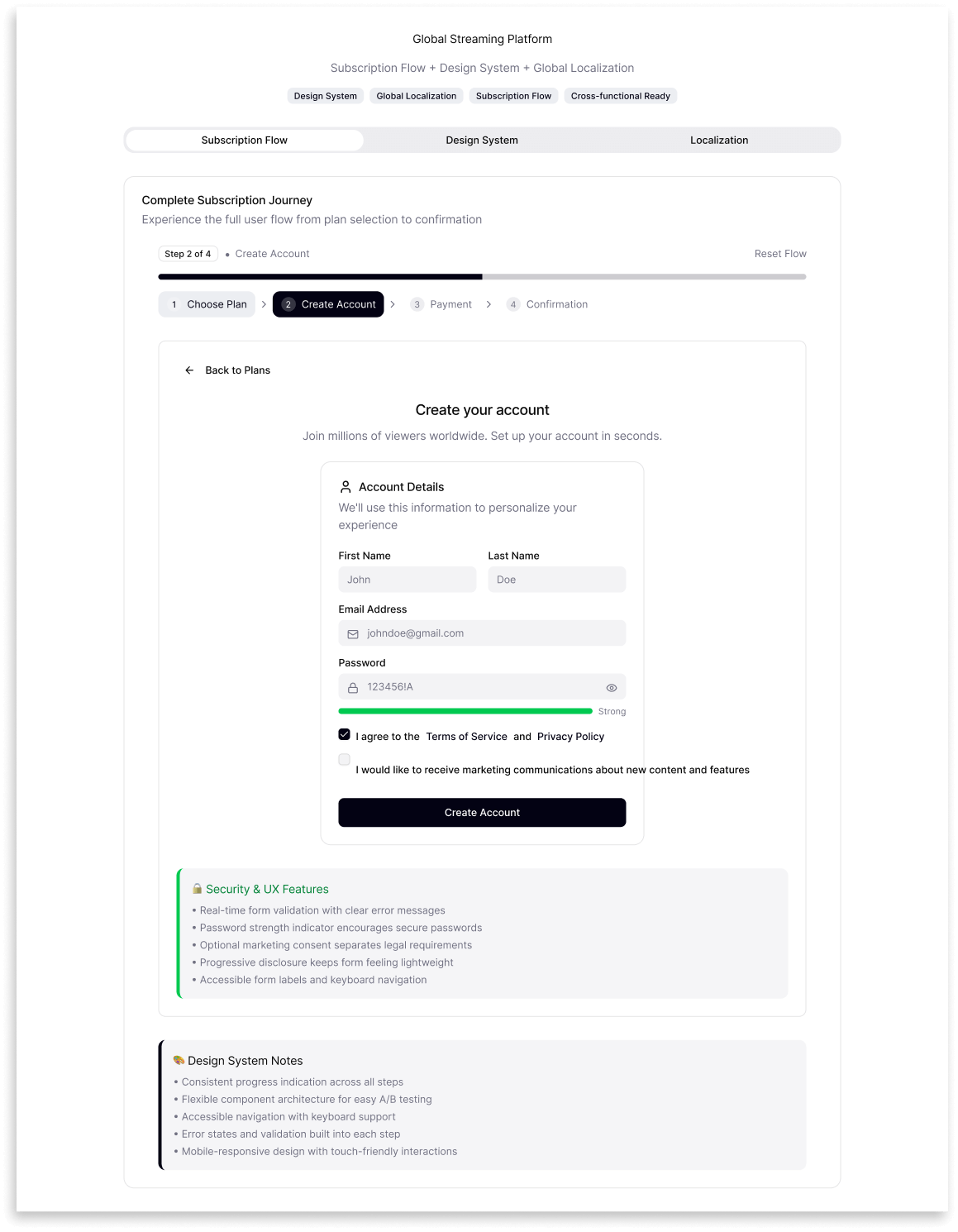
2. Account Creation
Once users selected a plan, the next step focused on creating a smooth, inclusive onboarding experience. The account form was designed for clarity, accessibility, and speed, with real-time validation that guided users through each field.
Localization went beyond translation — adapting tone, layout, and validation messages for English, Spanish, Chinese, and Arabic. Visually, it ensured harmony across light/dark modes and consistency on all devices, building trust through thoughtful microinteractions and global inclusivity.
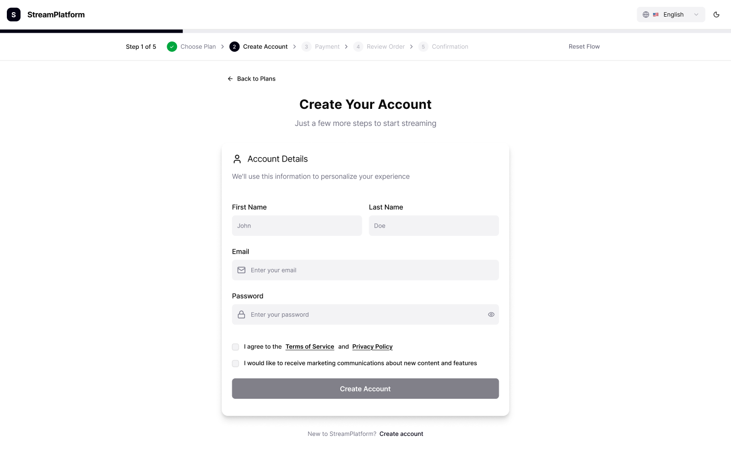
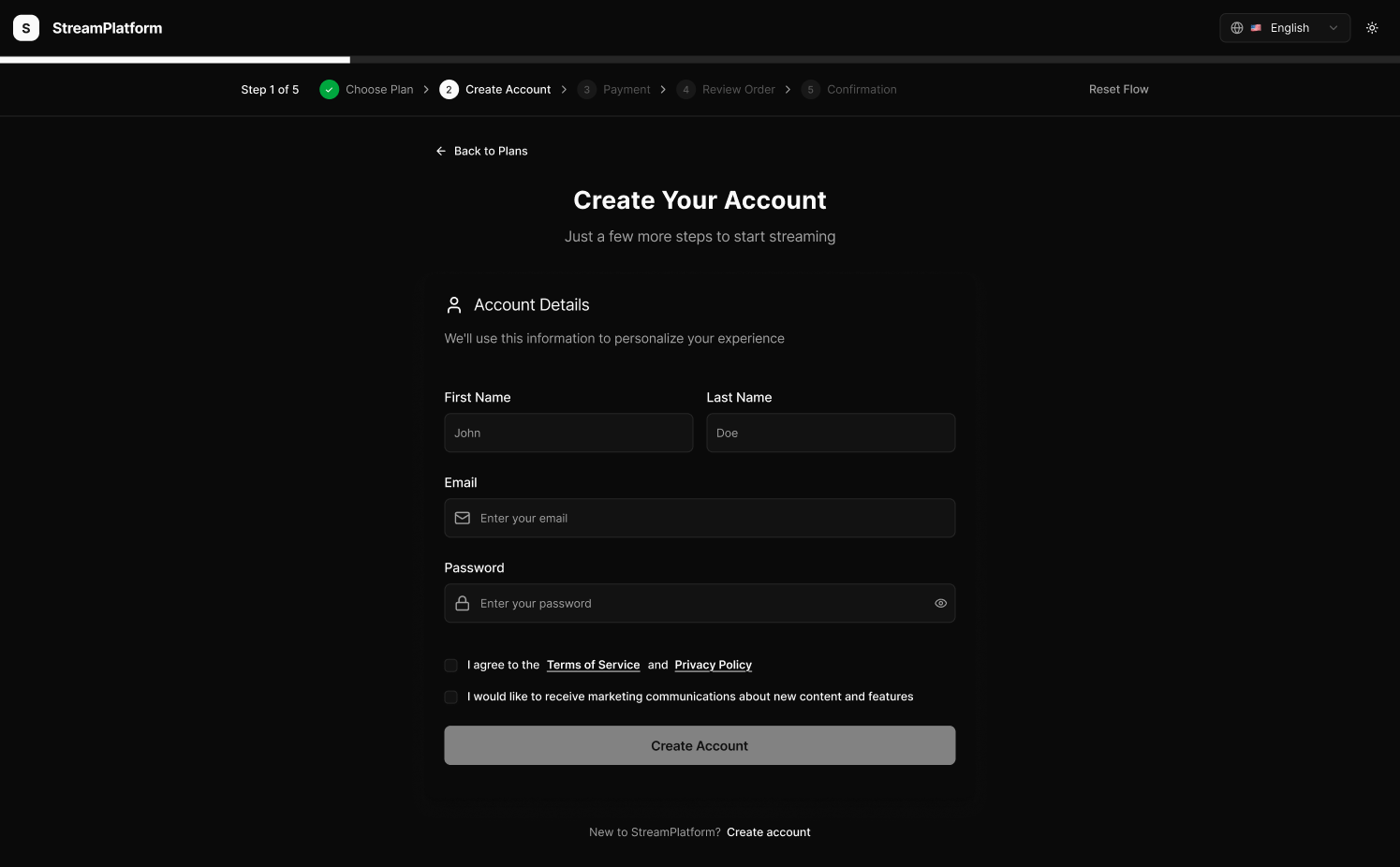
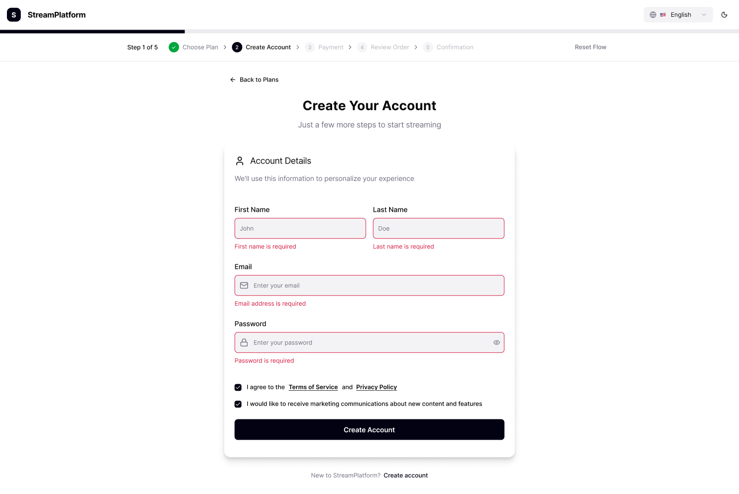
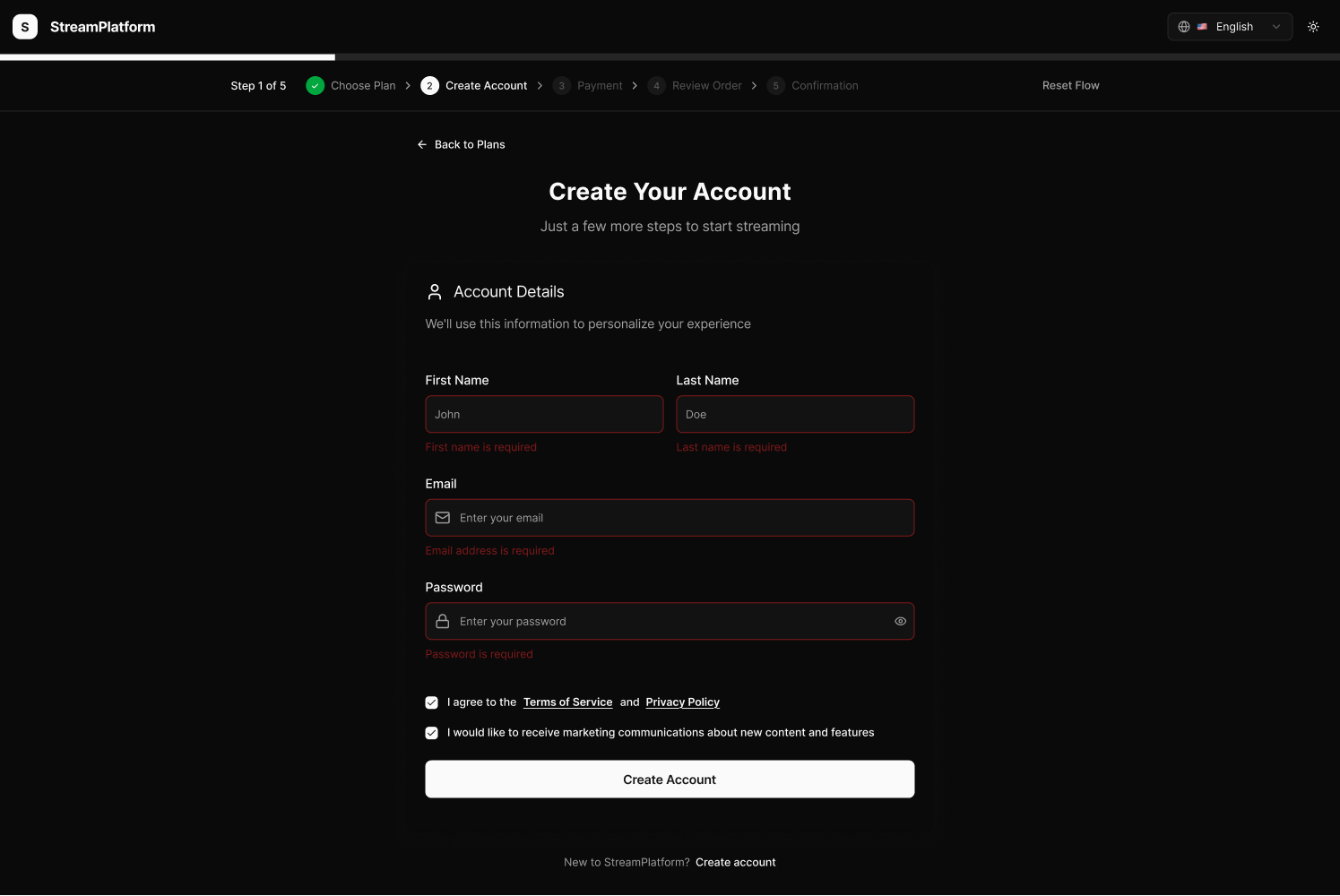
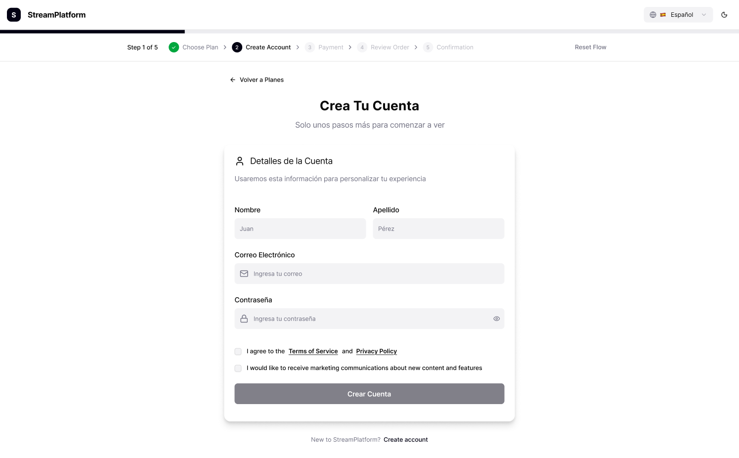
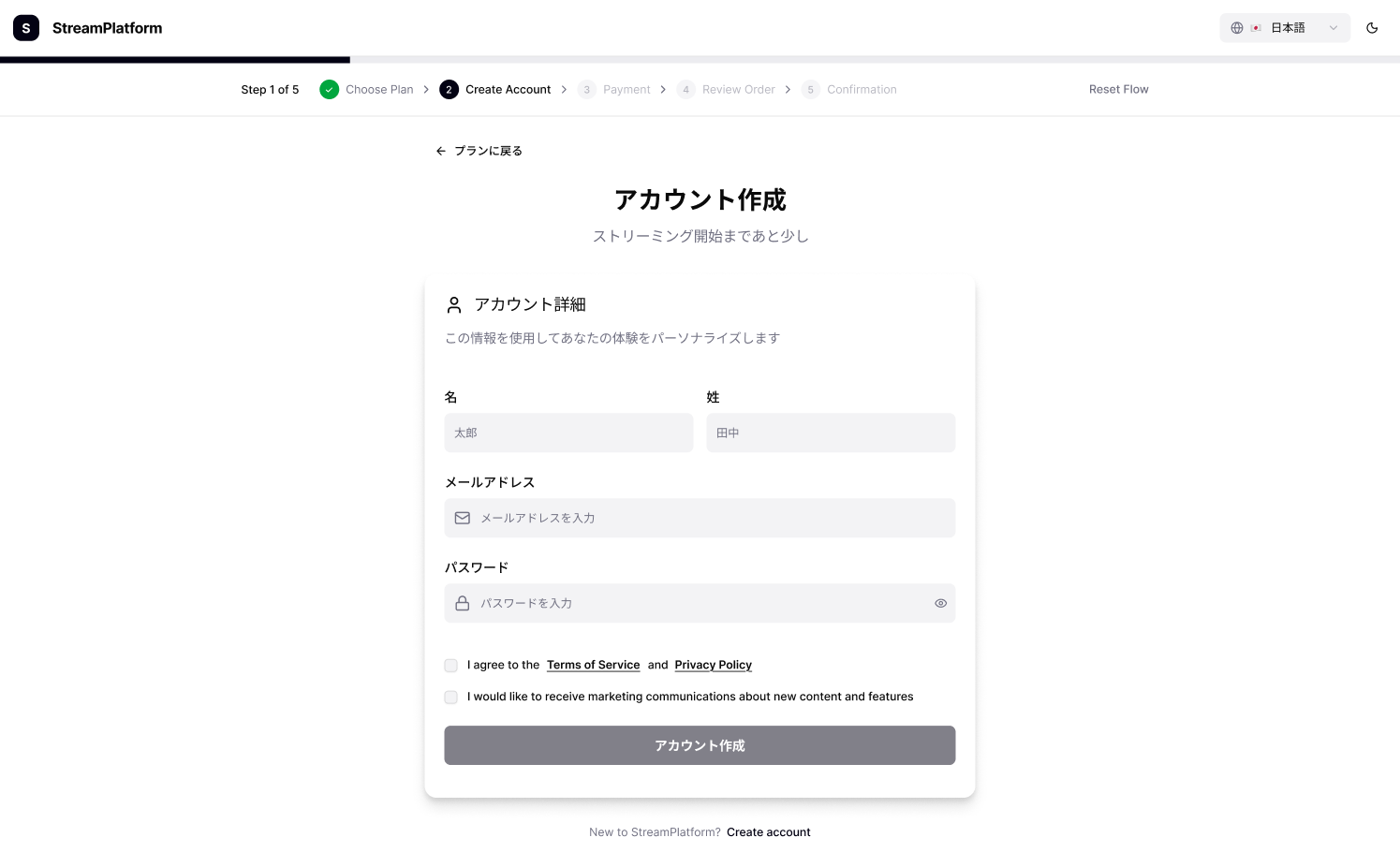
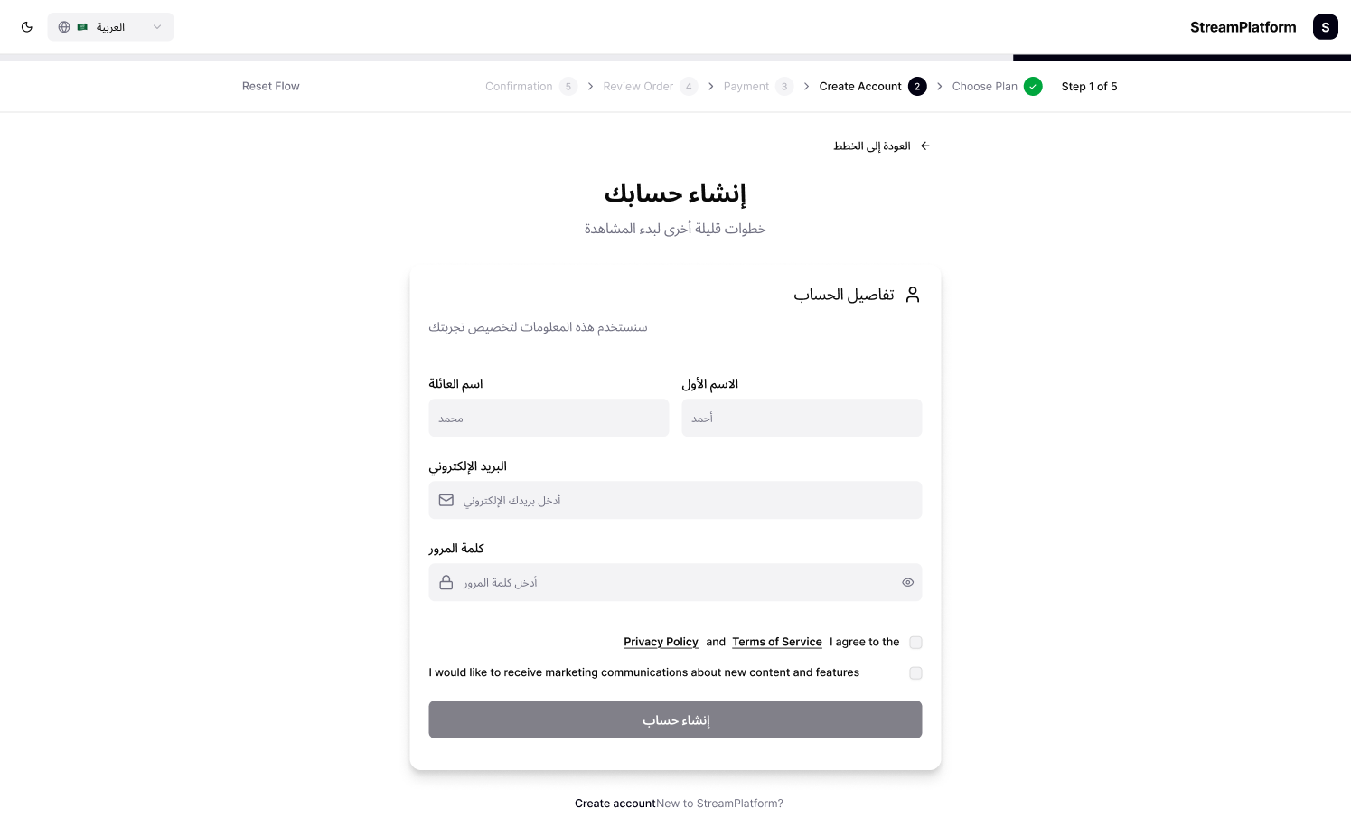
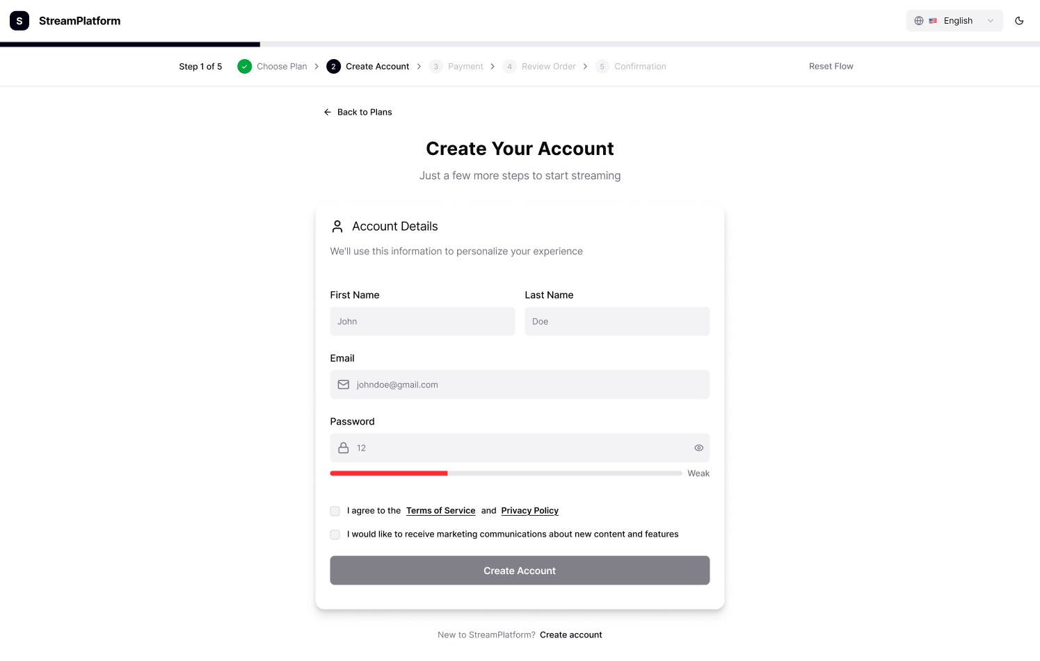
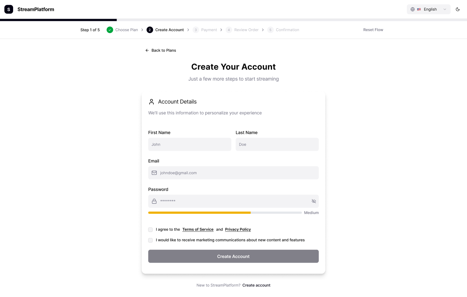
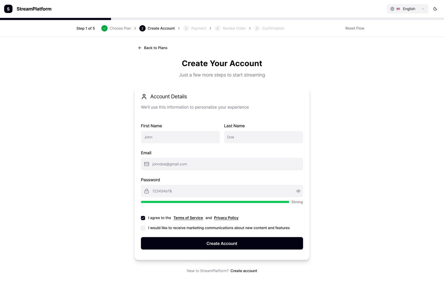
A focused look at the account creation step with inline validation and accessible feedback messages. Comprehensive view of the multilingual account creation flow across light and dark modes, designed for clarity, validation, and inclusivity.
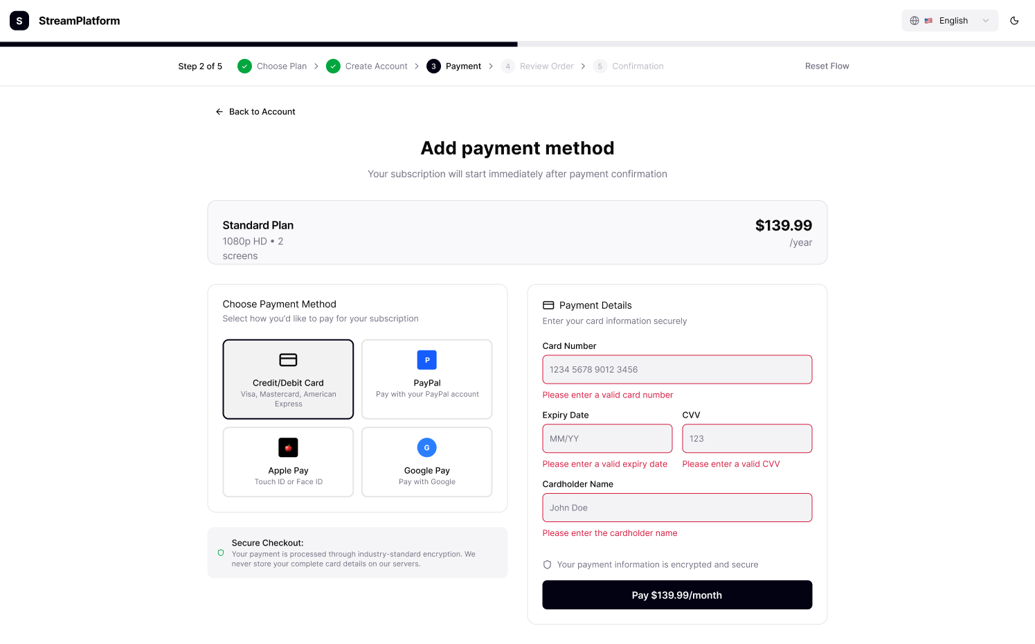
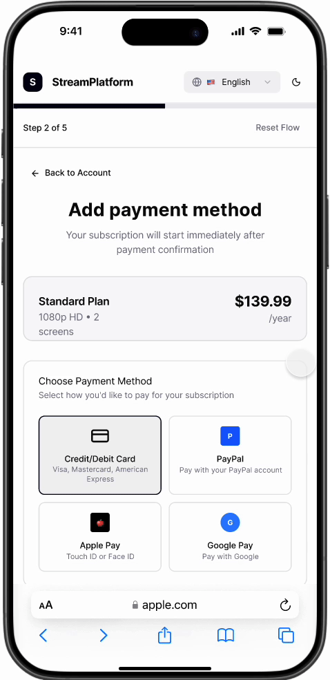
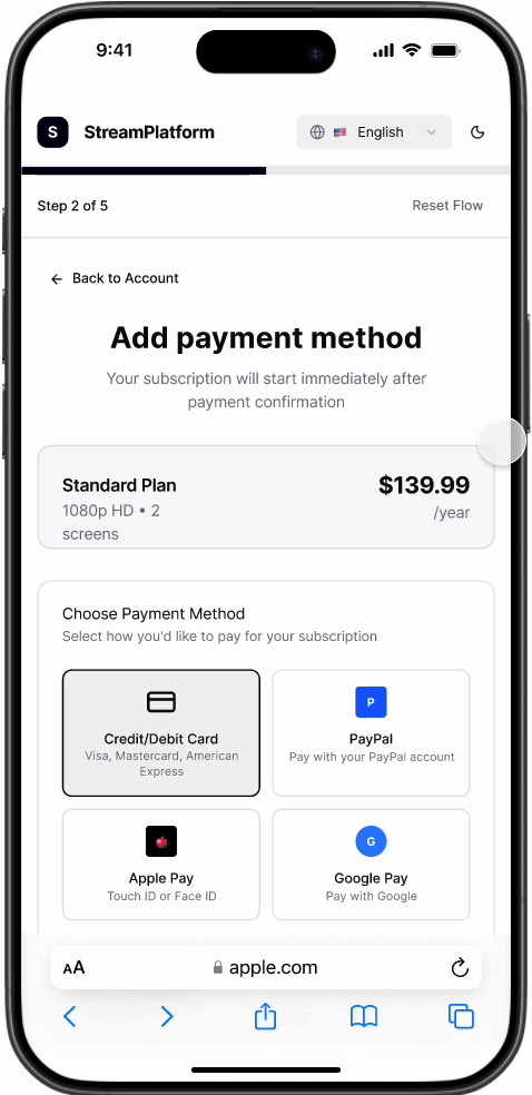
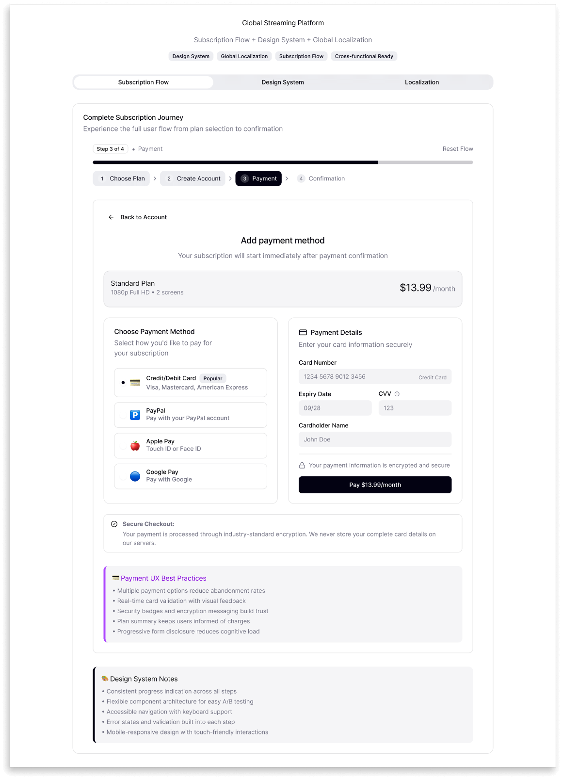
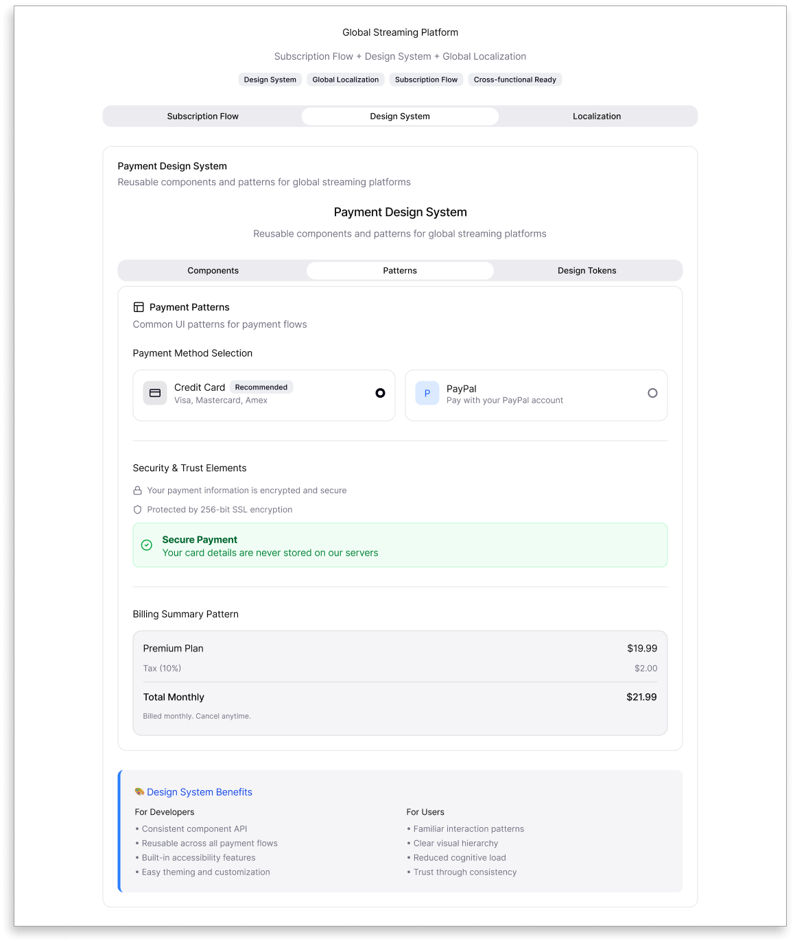
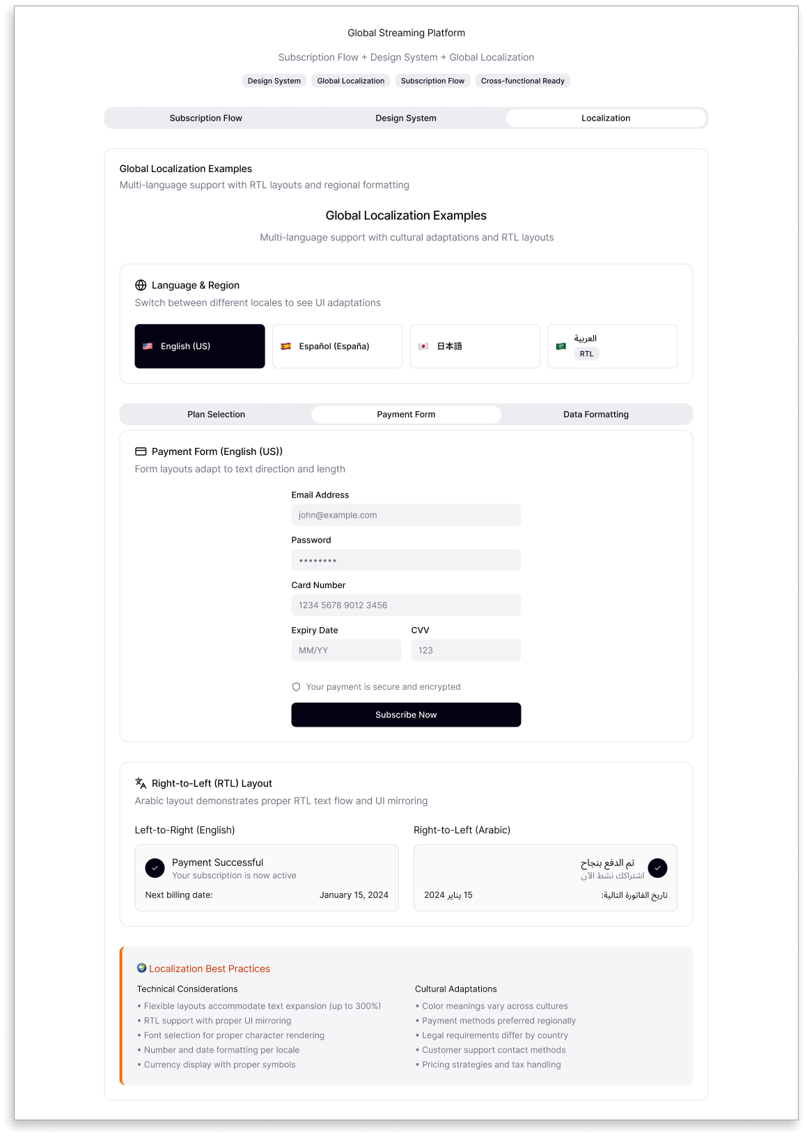
3. Payment
The payment flow was designed to balance trust, flexibility, and clarity — three essentials for successful checkouts. I reduced friction by simplifying inputs, improving visual hierarchy, and offering multiple payment options like credit cards, PayPal, and digital wallets.
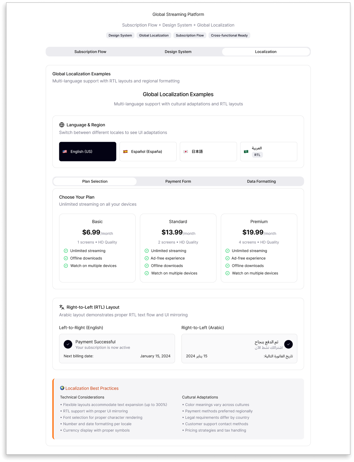
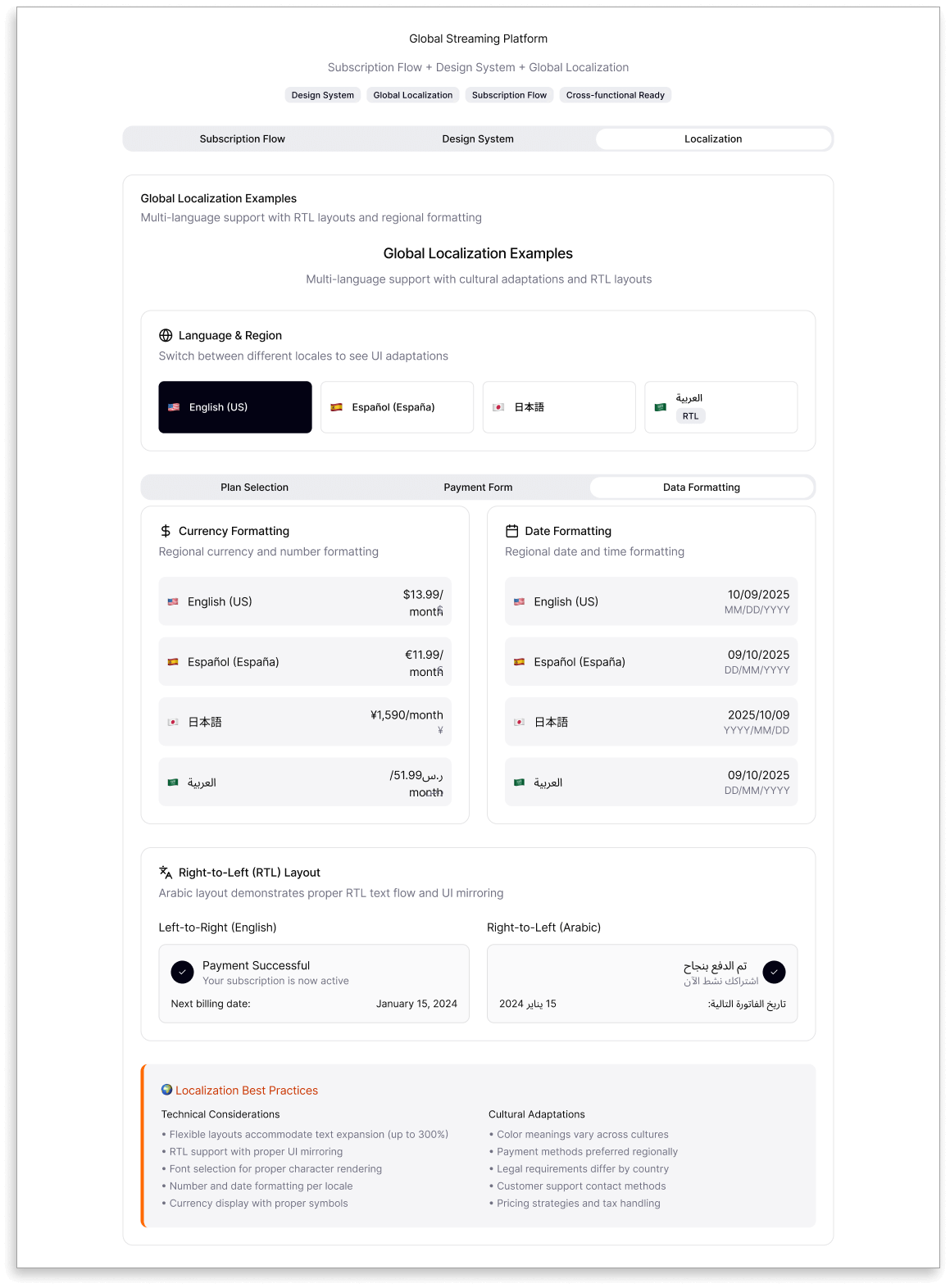
To serve a global audience, the design included localized currencies, languages, and right-to-left layouts for Arabic users. Error handling was transparent — with clear, actionable messages for failed or expired payments, ensuring users could recover easily.
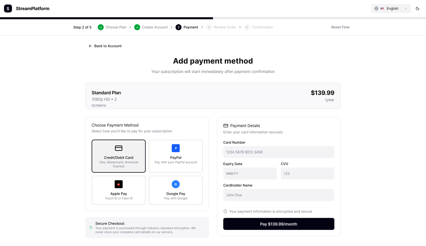
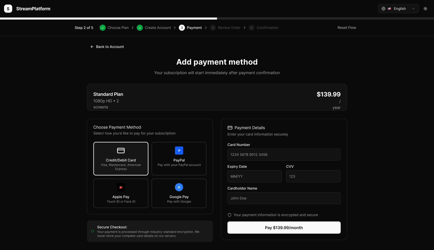

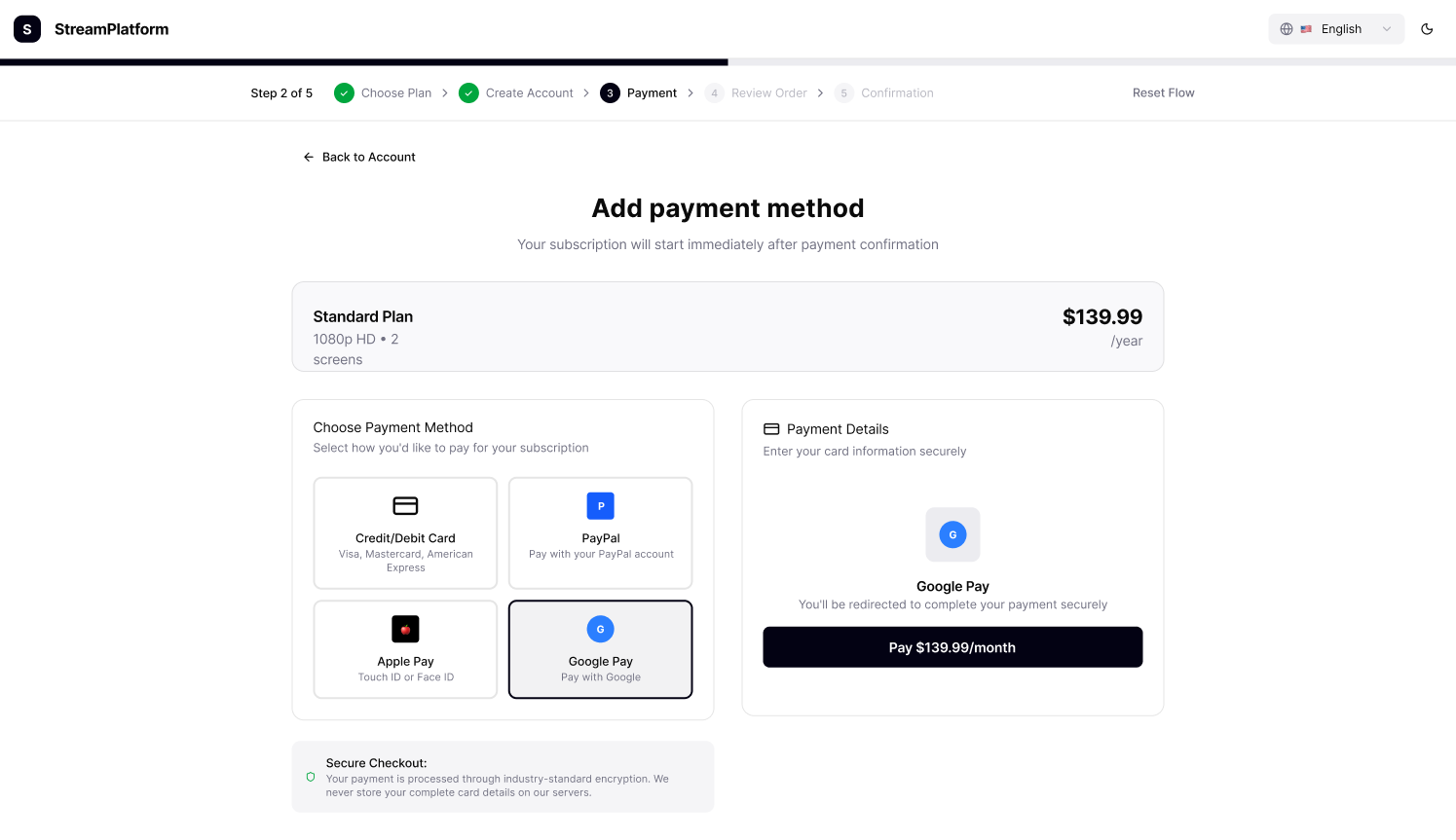
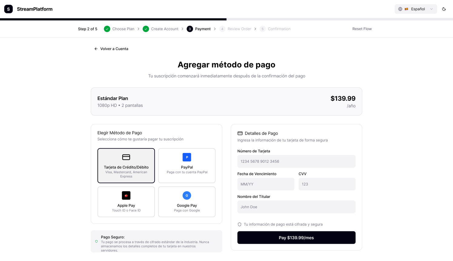
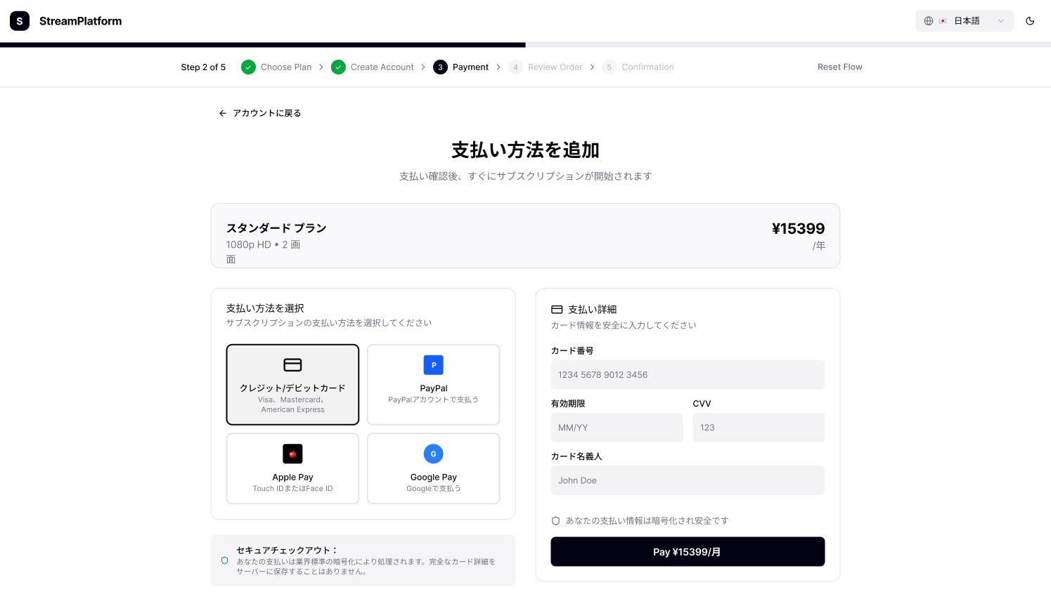
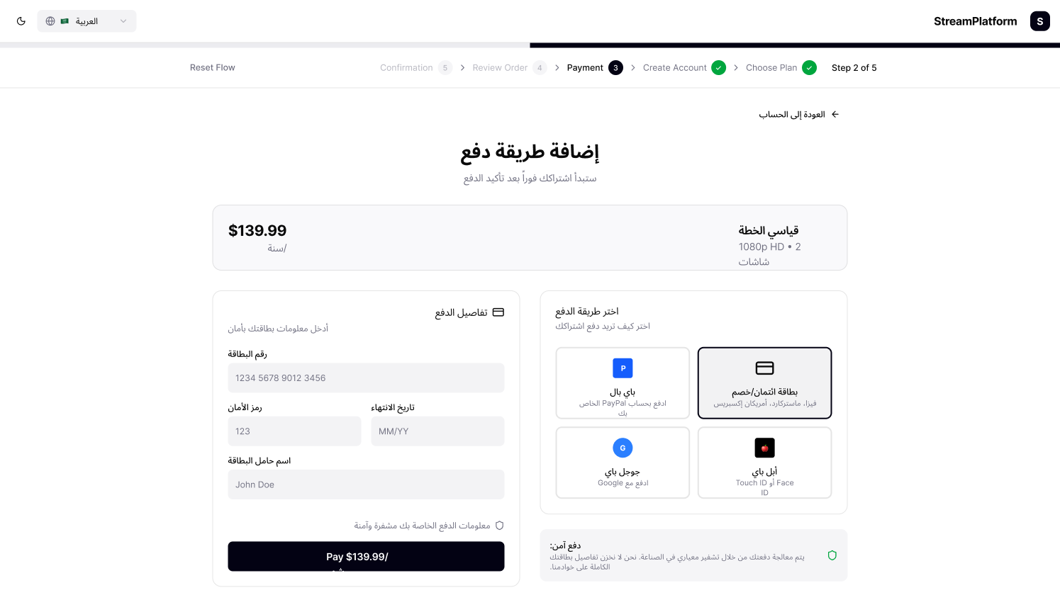
Detailed view of the payment step with localized currency, real-time validation, and accessible error feedback. Global payment flow with multilingual support, right-to-left layouts, and responsive light/dark designs across desktop and mobile.
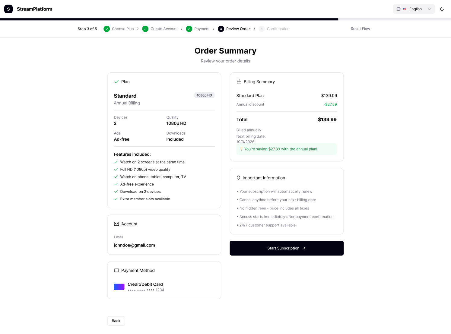
4. Preview Order
Before completing the subscription, users are invited to review their plan, billing details, and payment method in a clean, structured summary. This step was designed for clarity and reassurance — minimizing surprises and reinforcing transparency.
Highlights such as annual savings, renewal terms, and cancellation options are surfaced upfront to build trust and reduce cognitive load. By visually grouping key information and minimizing distractions, the interface helps users feel in control and confident about their choice before clicking Start Subscription.

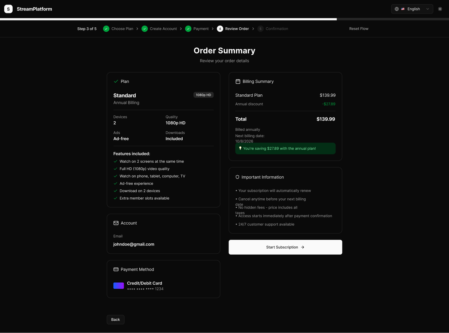
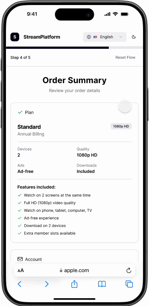
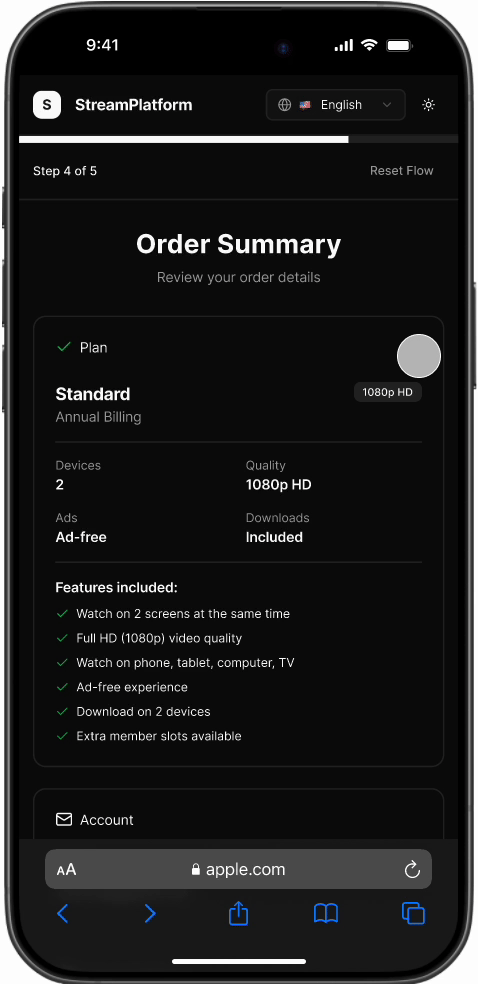
Users can review their selected plan, payment details, and billing summary before confirming the subscription. Transparent pricing and renewal details help reduce hesitation and build user trust.
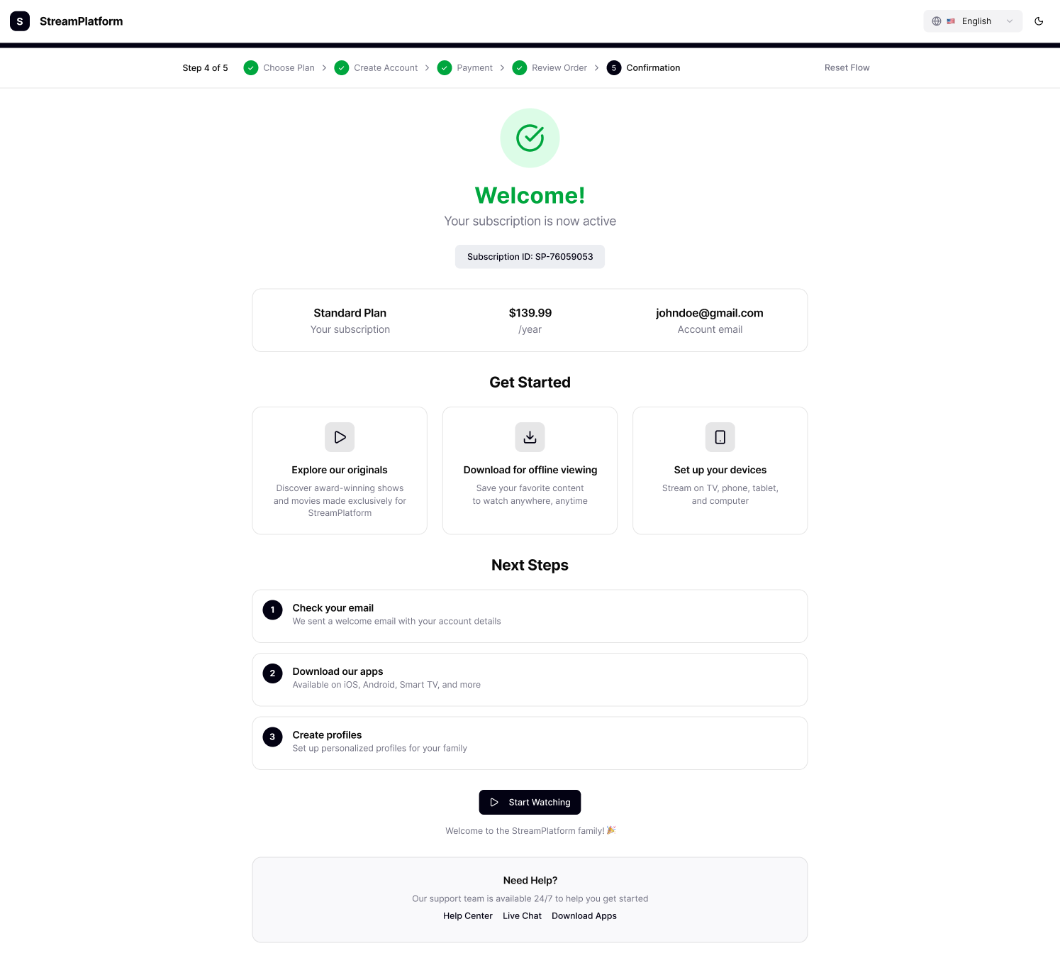
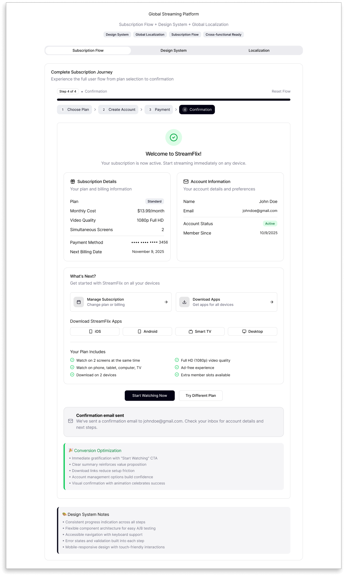
5. Confirmation
After payment, users arrive at a welcoming confirmation screen — a small but meaningful moment of success.
It reassures them that their subscription is active and account is ready, while the inviting “Start Watching” button sparks excitement to dive in.
Thoughtfully placed next steps guide users seamlessly from setup to discovery, turning a transactional moment into the first touch of the viewing experience.
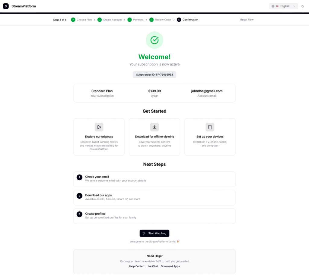
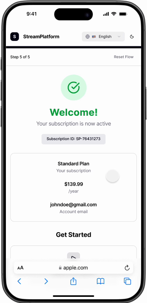
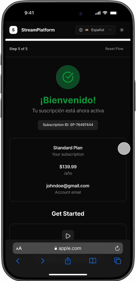
Final confirmation screen with success state, subscription summary, and clear next steps. Confirmation flow displayed in light and dark modes across desktop and mobile ensuring visual harmony and accessibility at every touchpoint.
Additional Design Layers
Beyond the main subscription flow, I designed supporting systems that ensured scalability, consistency, and inclusivity across markets and platforms.
Subscription Flow
Early low-fidelity layouts helped define information hierarchy and test flow logic before moving into visual design. These flows ensured clarity in navigation and reduced complexity across devices.
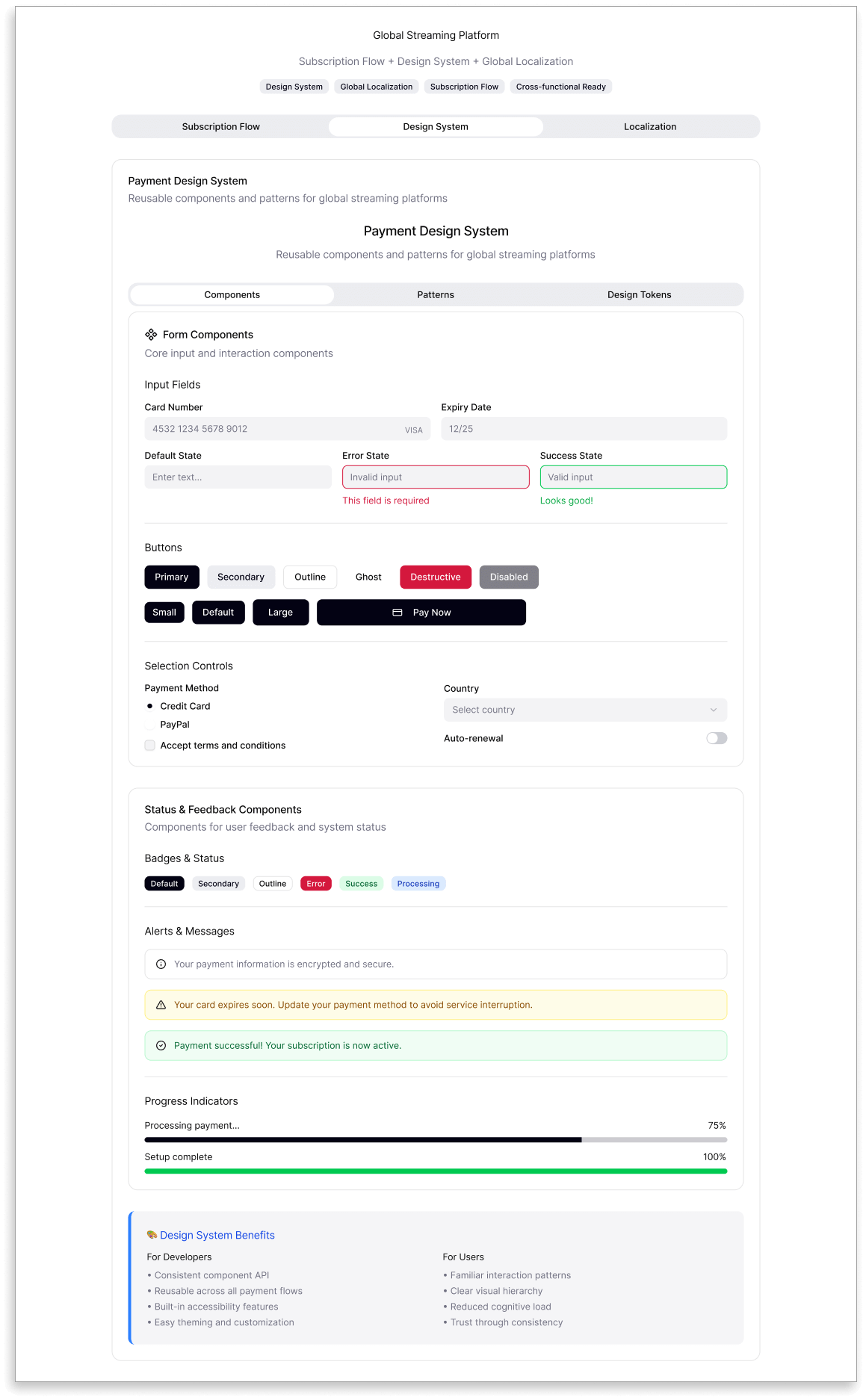
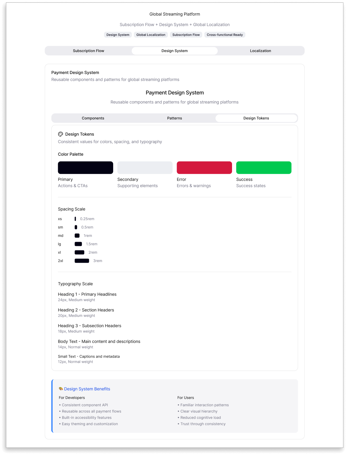
Design System
A reusable system of components, spacing, and typography built consistency across dark/light themes and screen sizes. It also enabled faster updates and seamless integration of new payment features.
Localization
Localized layouts and UX copy for English, Spanish, Chinese, and Arabic audiences. This process refined alignment, typography, and currency handling, making the experience accessible worldwide.
VALUE
Impact
The redesigned subscription flow improved usability, accessibility, and conversion clarity. Users completed sign-ups faster, with fewer drop-offs during plan selection and account creation.
Localization and accessibility updates — including RTL support, Chinese optimization, and dark mode — expanded reach globally. For the business, clear pricing and a simplified interface built trust, reduced support requests, and boosted retention.
Proxy Metrics: Speculative but believable — projected outcomes if tested.
- +12% increase in successful payments (reduced drop-offs)
- –20% reduction in payment-related customer support tickets
- +8% conversion lift in localized markets
- 30% faster integration of new payment methods through design system consistency
Ultimately, this project proved that when accessibility, clarity, and trust align, user satisfaction and business growth follow naturally.
REFLECTION
Lessons Learned
Designing a global subscription experience taught me how complex “simple” can be. Each language and payment type revealed unique user expectations, proving that inclusivity is more than translation; it’s understanding behavior and trust.
The biggest takeaway was learning to balance flexibility with clarity. From form validation to copy tone, every detail shaped how confident users felt completing their purchase. This project reinforced my belief that great UX happens when friction fades and every step feels natural.
FINAL THOUGHT
My Design Philosophy
This project embodies my belief that meaningful design bridges empathy and efficiency. I strive to create experiences that don’t just look good, but make sense — for users, for teams, and for the business.
My goal as a designer is to build digital products that feel intuitive in any language and inspire confidence at every click. Whether it’s through accessibility, localization, or visual storytelling, I aim to craft solutions that connect people and technology in the most human way possible.